How To Build Your Own Design System With Nested + Stacked Presets In Divi 5
Design systems fail either because they don’t account for every possibility or because they become too complicated to manage. A standard website needs styles for headings, body text, buttons, and containers (to name a few). Multiply those across light and dark backgrounds, different sizes, and other use cases, and you end up managing hundreds of CSS classes/presets that overlap, conflict, and become impossible to maintain.
Stacked and Nested Presets in Divi 5 help solve this problem by separating concerns. Instead of creating a preset for every possible combination (H1 Dark Bold, H1 Light Bold, H1 Dark Normal, H1 Light Normal, and so on), you create modular styles that stack together.
This tutorial builds a complete design system from scratch, then applies it to a homepage with four unique sections. You will create Design Variables for spacing, typography, and colors, build Option Group Presets for layouts and styling, and nest those Option Group Presets inside Element Presets for fast deployment. The best part of this is that you can export and import all these presets and variables to use and modify on every new website build.

The first five parts of this tutorial create around 40 Design Variables and dozens of Presets. In part six, we will add modules to the page and build out a real design. To fully follow this tutorial, you will need between one and three hours, depending on your experience with web design and/or Divi 5.
Part 1: Creating Design Variables
Design Variables store values you reference throughout your site. When you update a variable, every element using that variable updates automatically. The variables shown here provide a foundation that you can expand as your design system grows.
Typography Size Variables
Open the Variable Manager by clicking the variables icon in the left sidebar. Create Number variables for each typography level using clamp() functions for fluid sizing. The three values in each clamp represent the minimum size, the preferred scaling calculation, and the maximum size.
Create the following Number variables for headings:
- H1 – Large with the value clamp(3.8rem, 3.7rem + 0.8vw, 4.2rem) provides a Hero-sized typography option if you need something bigger in special cases.
- H1 uses clamp(3.3rem, 3.1rem + 0.7vw, 3.7rem) for template page H1 headings.
- H2 uses clamp(2.7rem, 2.6rem + 0.6vw, 3.1rem) for primary section headings.
- H3 uses clamp(2.3rem, 2.1rem + 0.5vw, 2.6rem) for subsection headings.
- H4 uses clamp(1.9rem, 1.8rem + 0.4vw, 2.2rem) for smaller content divisions.
- H5 uses clamp(1.6rem, 1.5rem + 0.3vw, 1.8rem) for minor headings.
- H6 uses clamp(1.3rem, 1.2rem + 0.3vw, 1.5rem) for the smallest heading level.
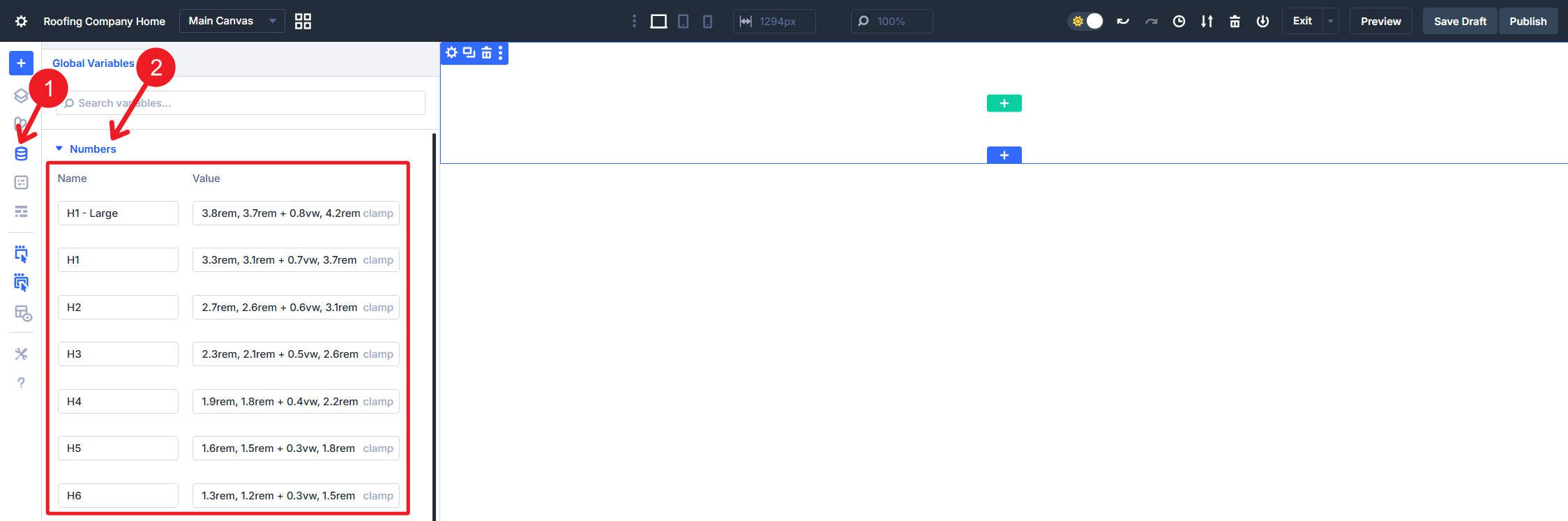
Make sure to click “Save Variables” often.
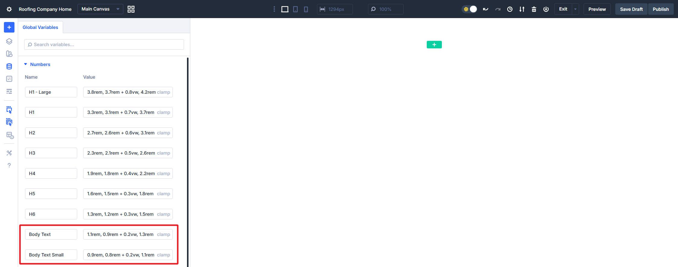
Create two body text size variables that will be used for most body text and buttons:
- Body Text uses clamp(1.1rem, 0.9rem + 0.2vw, 1.3rem) for standard paragraph content and buttons.
- Body Text Small uses clamp(0.9rem, 0.8rem + 0.2vw, 1.1rem) for captions, metadata, and secondary content, including smaller buttons.
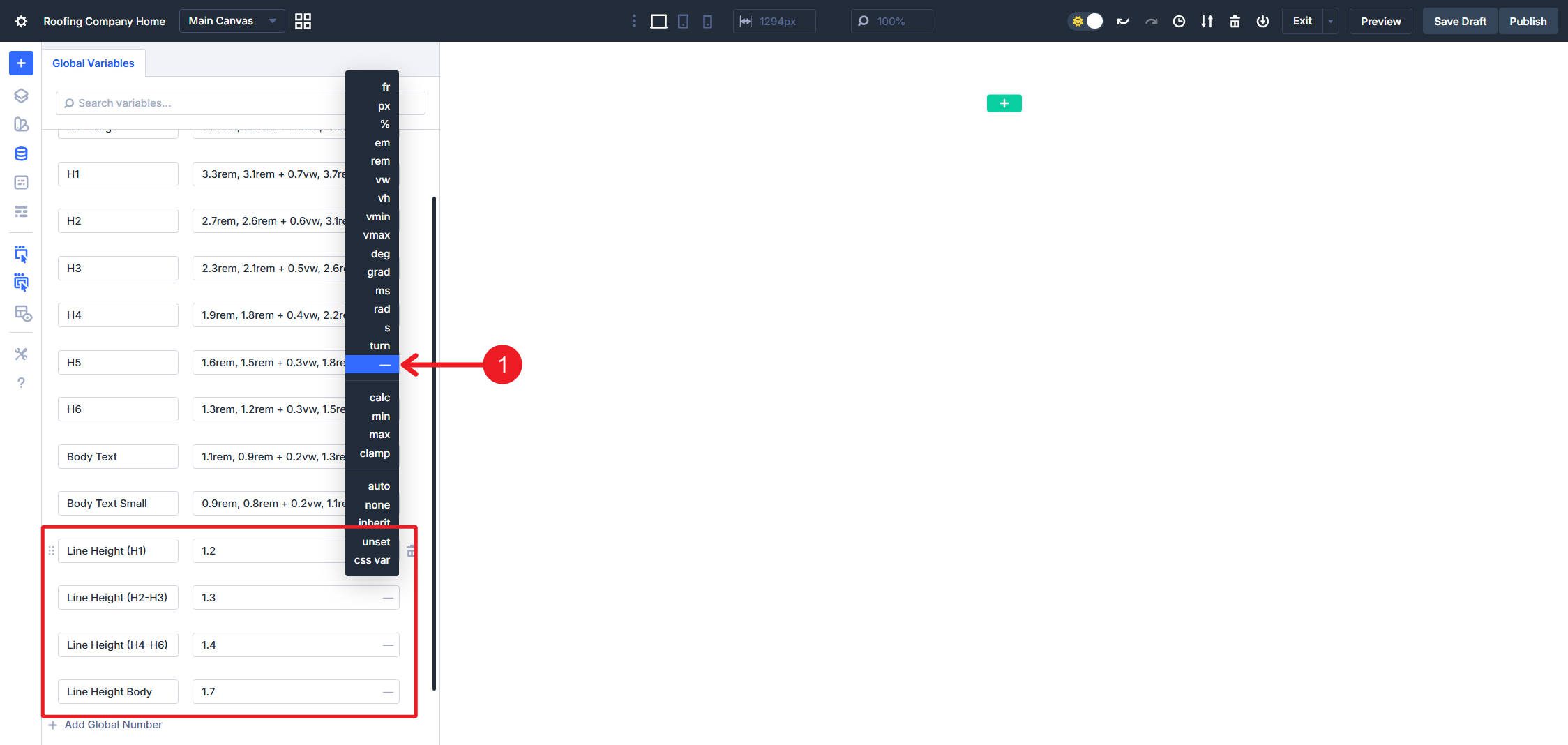
Typography Line Height Variables
Line Height will complement your font choices and your font sizes for both headings and paragraphs. For this build, I created five variables that should work across the whole site:
- Line Height (H1) uses a unitless value of 1.2 and will work for H1 – Large and H1 font sizes.
- Line Height (H2-H3) uses a unitless value of 1.3.
- Line Height (H4-H6) uses a unitless value of 1.4.
- Line Height Body uses a unitless value of 1.7.
- Line Height Body Small uses a unitless value of 1.6.
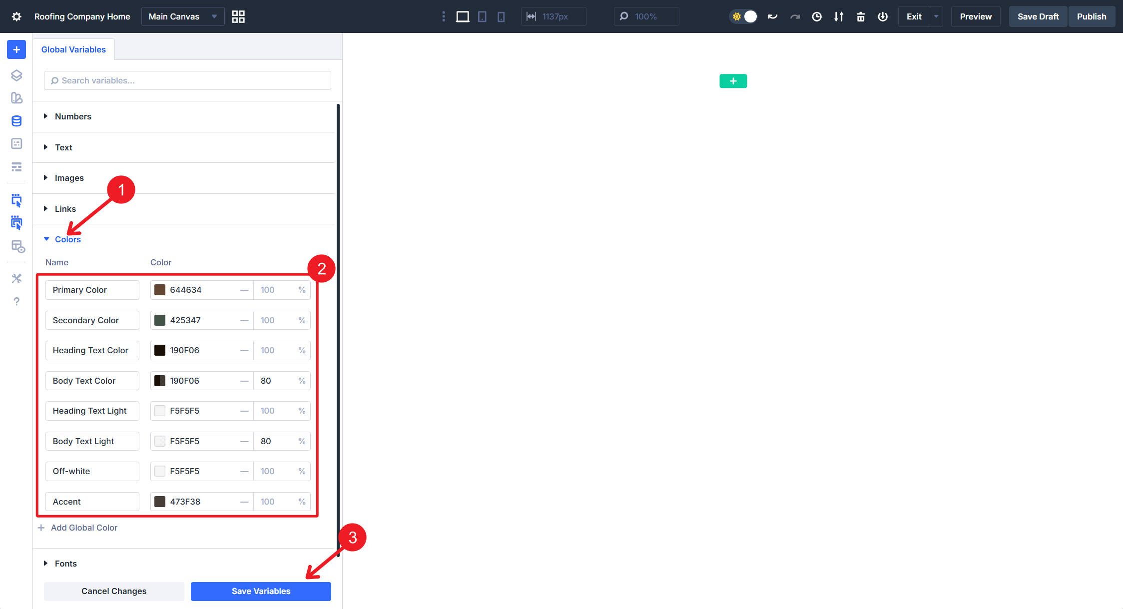
Color Variables
For a change of pace (we’ll go back to numbers in a second), set up your Color variables, separating standard colors from light variants used on dark backgrounds.
- Primary uses #644634.
- Secondary uses #425347.
- Heading Text uses #190f06 for standard heading color on light backgrounds.
- Body Text uses #190f06 at 80% Opacity for paragraph content on light backgrounds.
- Heading Text Light uses #f5f5f5 for headings on dark backgrounds.
- Body Text Light uses #f5f5f5 at 80% Opacity for body content on dark backgrounds.
- Body Text Light Link uses #dcebe1 at 90% Opacity for links within body content on dark backgrounds.
- Off-white uses #f5f5f5 for tertiary buttons and subdued elements. If you think it is less confusing to just use the Heading Text Light for this, you can skip this variable.
- Accent uses #473f38, which we will use for dark background sections.
Relative Color Variables
It is helpful to have color variations for borders, hover effects, and other things as they arise.
- Primary Light uses your primary color with HSL filters of –15% Saturation and 30% Lightness.
- Primary Dark uses your primary color with HSL filters of –15% Lightness.
- Secondary Light uses your secondary color with HSL filters of –5% Saturation and 30% Lightness.
- Secondary Dark uses your secondary color with HSL filters of –10% Saturation and –15% Lightness.
I do this for at least primary and secondary colors, but if you have other colors you use frequently, you can create variations for them too.
Spacing Variables
Spacing variables handle padding, margins, and gaps throughout your layout. Having multiple sizes lets you maintain proportional relationships across your design system. Also, you’ll use these often, so having them set up at the beginning is a huge help.
Create the following Number variables:
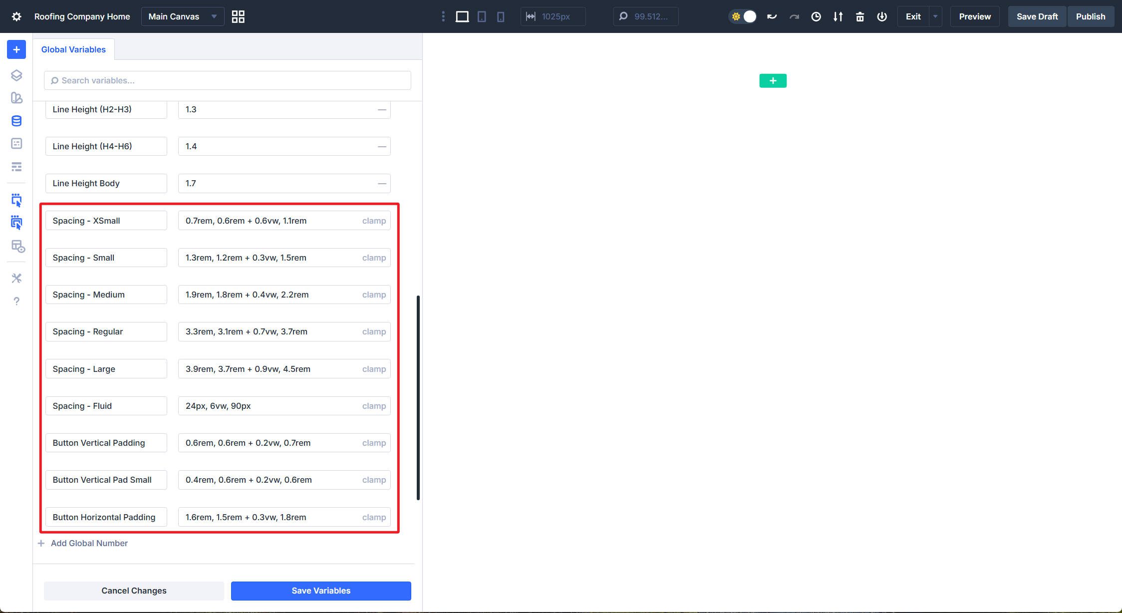
- Spacing – XSmall uses clamp(0.7rem, 0.6rem + 0.6vw, 1.1rem) for tight spacing between related elements.
- Spacing – Small uses clamp(1.3rem, 1.2rem + 0.3vw, 1.5rem) for compact internal padding.
- Spacing – Medium uses clamp(1.9rem, 1.8rem + 0.4vw, 2.2rem) for standard element separation.
- Spacing – Regular uses clamp(3.3rem, 3.1rem + 0.7vw, 3.7rem) for comfortable section padding.
- Spacing – Large uses clamp(3.9rem, 3.7rem + 0.9vw, 4.5rem) for generous vertical rhythm.
- Spacing – Fluid uses clamp(24px, 6vw, 90px) for responsive gutters that scale significantly between mobile and desktop.
I personally like clamp() values for spacing that match closely with text size. But many people will use straight rem values and use them across breakpoints. Whatever works for you.
For buttons, I tend to prefer specific padding values over more general ones.
- Button Vertical Padding uses clamp(0.6rem, 0.6rem + 0.2vw, 0.7rem) for a normal height button.
- Button Vertical Padding Small uses clamp(0.4rem, 0.6rem + 0.2vw, 0.6rem) when you need a tighter button.
- Button Horizontal Padding uses clamp(1.6rem, 1.5rem + 0.3vw, 1.8rem) to maintain consistent left/right padding across all buttons. You can add a small variation if you like.
Layout Variables
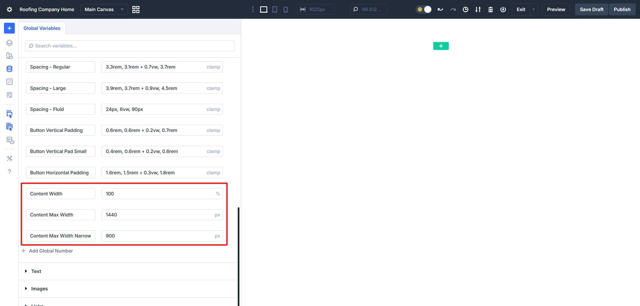
These next ones are great for setting on your Sections and Rows. Using them as design variables lets you adjust the width of your site content at any time during your design process. Create these variables:
- Content Width uses 100% as the base width for rows.
- Content Max Width uses 1440px to cap content width on large screens.
- Content Max Width – Narrow uses 900px for smaller content features and is nice for variety and text-only callouts.
Border Radius Variables
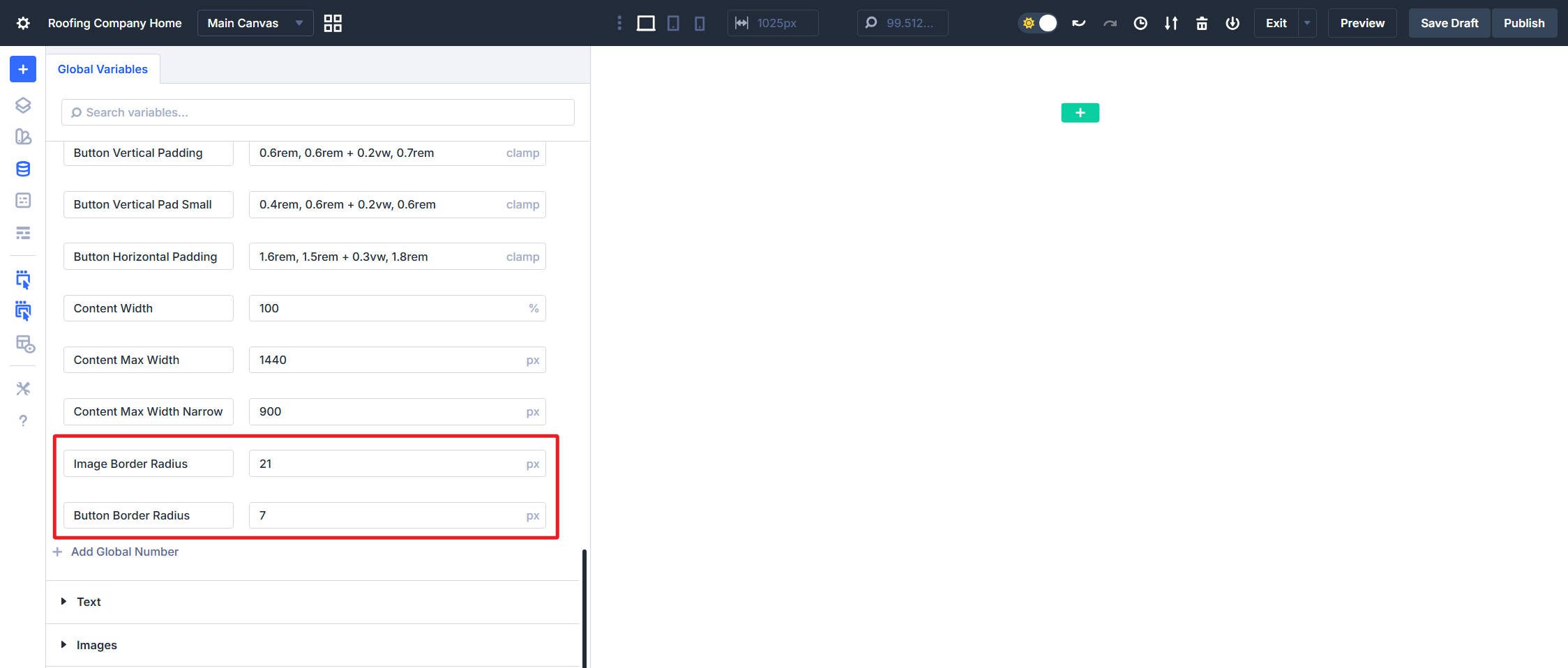
This design will use two different border radius values. To keep things consistent across the whole build, I’ll set them up as Design Variables.
- Image Border Radius uses 21px.
- Button Border Radius uses a simple 7px setting for slightly rounded buttons.
Default Font
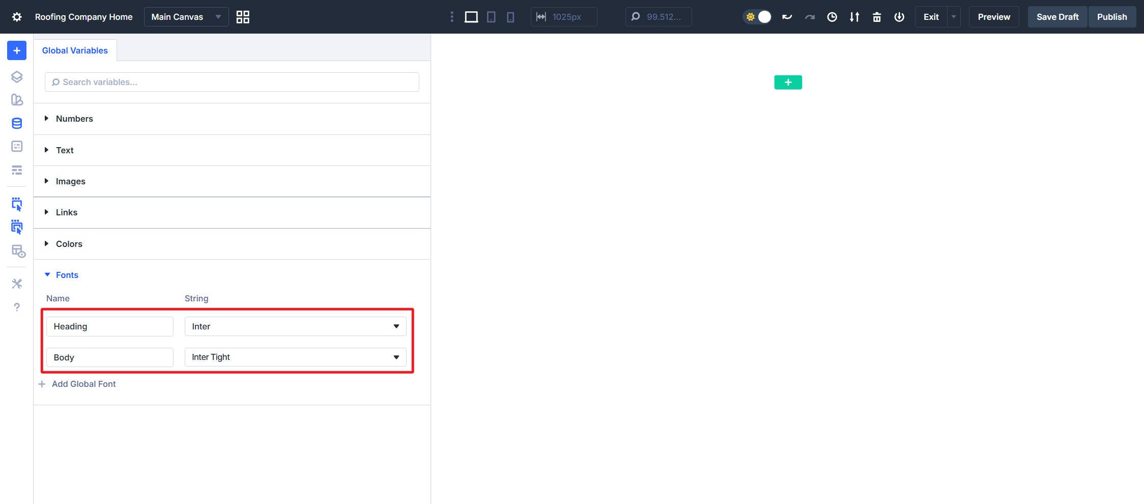
Set your default Fonts to whatever you prefer. I will be using:
- Heading font set to Inter
- Body font set to Inter Tight
One last reminder to save your Design Variables
Part 2: Building Layout Presets For Sections And Rows
Everything you build in Divi is inside Sections and Rows. Creating default presets for these, along with a few variations, will add consistency and polish to your sites.
Section Layout Presets
Sections are easy to set up. An essential aspect of sections is creating a site “gutter.” This is your padding applied to the left and right sides of your screen and is often most important at smaller breakpoints. We will also configure flex settings so rows stack vertically rather than horizontally.
Section Gutters
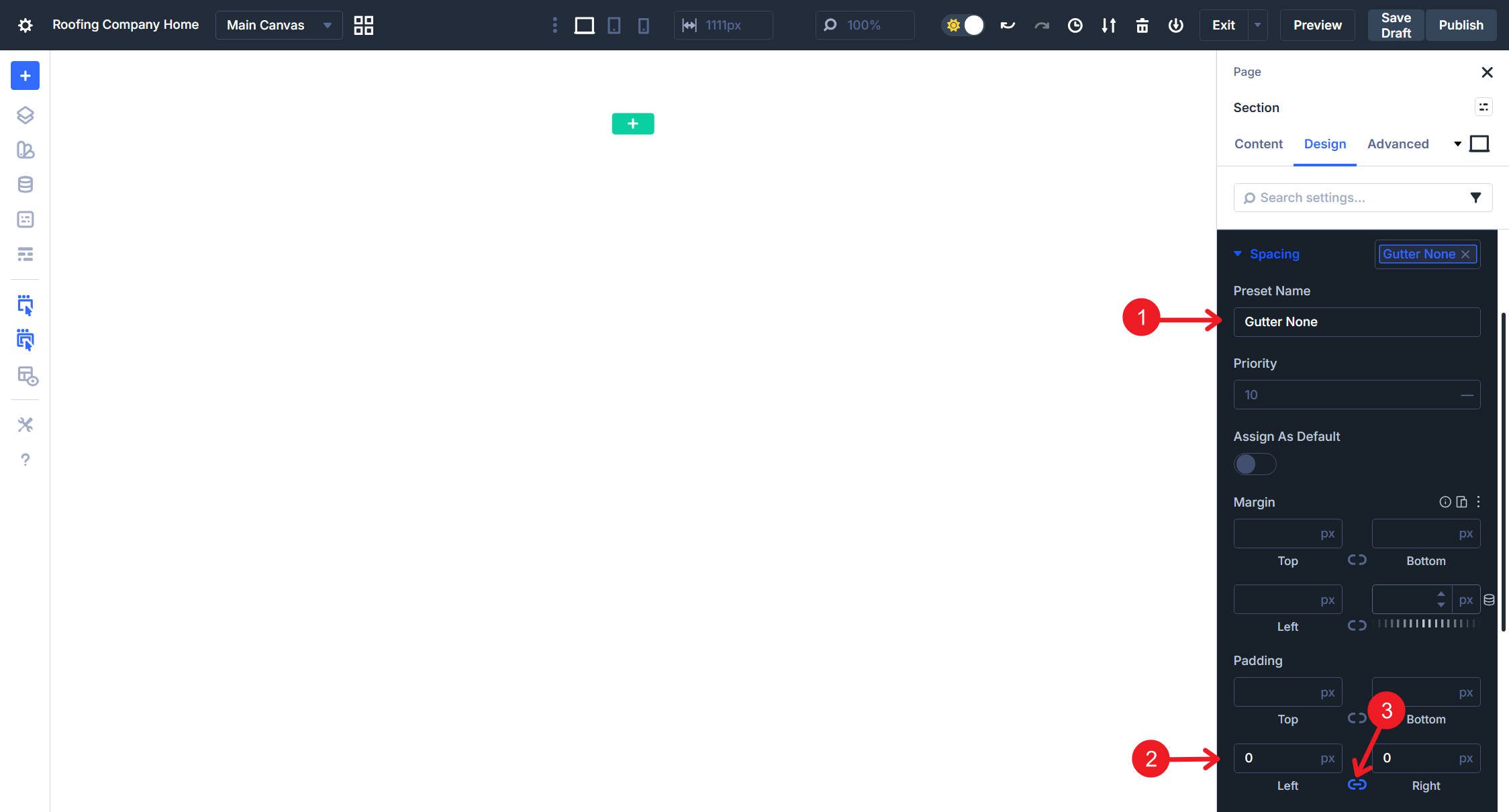
Create a Spacing Option Group Preset named Gutter. Set the Left/Right Padding to Spacing – Fluid.
Make a second Spacing Option Group Preset and call it Gutter None or No Gutter. Set Left and Right Padding set to 0px. Use this for full-bleed sections where Row content should extend to screen edges.
Section Flex Settings
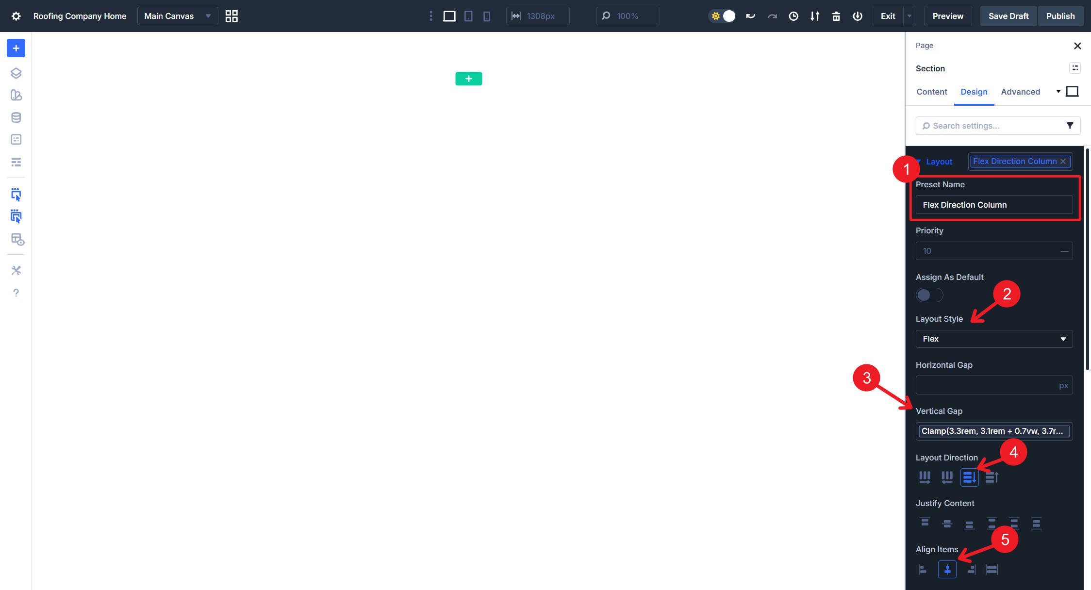
Sections stack Rows inside them vertically by default. Divi also assigns default gap, justify, and align values that we can customize for our site.
Inside the Section, visit the Layout option group, and create an Option Group Preset called Flex Direction Column. Set the Display to Flex, Flex Direction to Column, Align Items to Center, and Vertical Gap to Spacing – Regular.
Section Background Presets
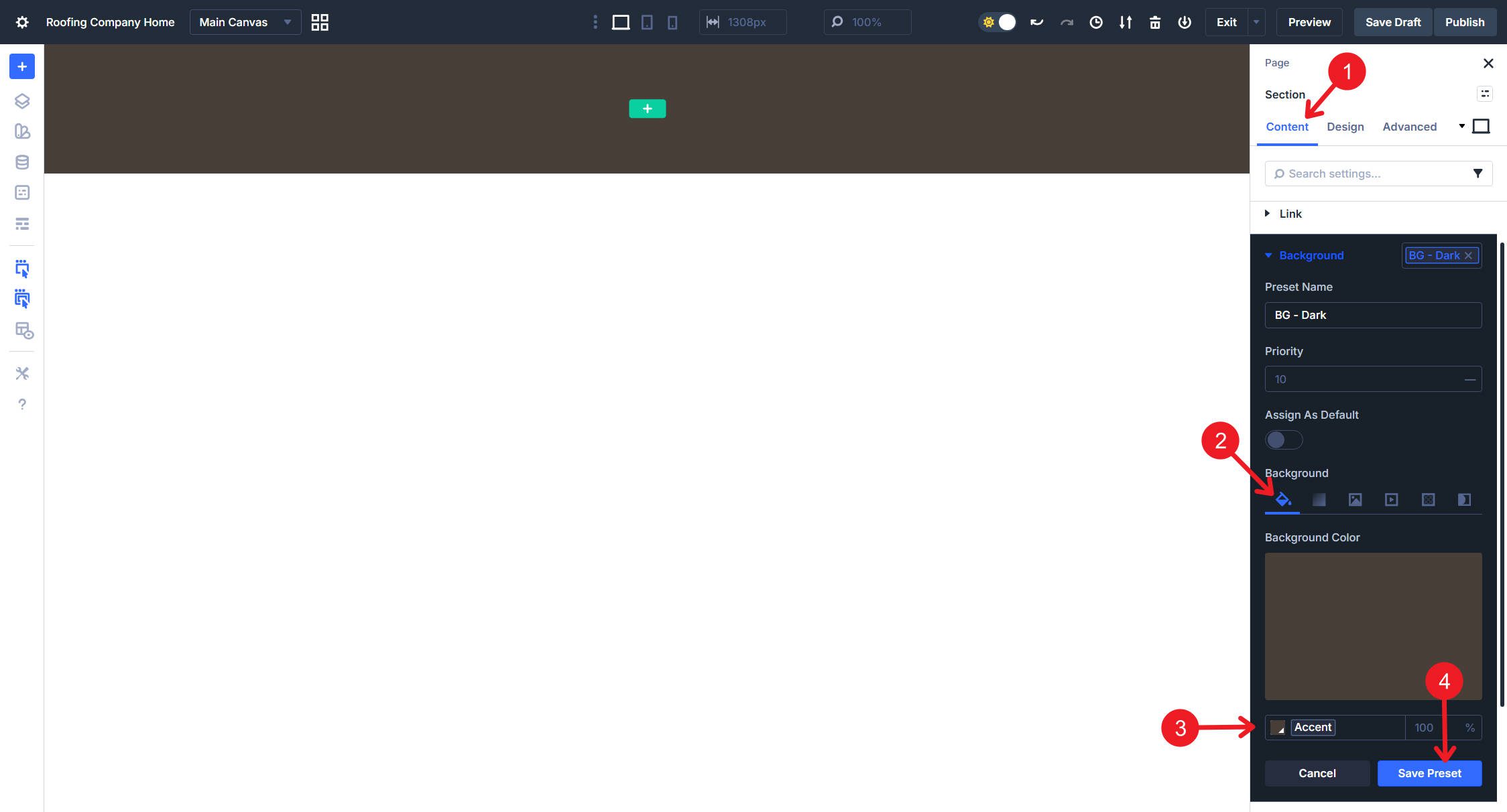
Background presets let you quickly swap between light and dark section styles. In the Section’s Background option group, create an Option Group Preset named BG – Dark. Set the Background Color to use the Accent Color Variable.
Create BG – Light with Background Color set to white (#ffffff) or your preferred light background color.
Create BG – Off-white with Background Color set to a subtle Off-white or light gray (#f5f5f5 works well). This provides visual separation between sections without the high contrast of dark backgrounds.
Make sure you have a blank Background Option Group Preset set and set as your default.
Section Element Presets
Now that we have all the granular Option Group Presets created, we can combine them so they are easy to deploy together. We will create variations for different background needs.
Edit the Default Section Preset. Add the Gutter preset from Spacing, the Flex Direction Column preset from Layout, and the BG – Light preset from Background and save. You can name it Section – Light. This gives every new section proper gutters, vertical stacking, and a clean light background.
Do the same for a new Section Element Preset named Section – Dark. Add the Gutter preset from Spacing, Flex Direction Column from Layout, and BG – Dark from Background.
And then again for a new Section Element Preset named Section – Neutral, following the same pattern, but using BG – Off-white for the background. This works well for alternating sections that need visual separation without going fully dark.
Create a new Section Element Preset named Section – Full Bleed (or No Gutter, Fullscreen—whatever name makes sense to you). Add No Gutter from Spacing, Flex Direction Column from Layout, and BG – Light from Background. Use this when row content should extend to screen edges.
You now have four section variations. The default handles 70% of cases automatically, while Dark, Neutral, and Full Bleed options are ready when you need them. Of course, you could create other variations, but this will at least get you going.
Row Presets
Things get a little more interesting with Rows, as Rows constrain content width within sections.
Row Width Presets
With a Row, open its Default Row Element Preset and navigate to its Sizing option group. Set the Width to 100% variable and Max Width to your Content Max Width variable (1440px). Name the default preset Row – Standard Width.
Create another Row Element Preset named Row – Narrow with Width at 100% and Max Width set to your Content Max Width – Narrow variable (900px). This focuses attention on text-heavy content blocks and adds visual variety to your layouts.
Create Row – Fullwidth with Width set to 100% and Max Width set to none. This row expands to fill the available space in the section which is useful for full-bleed images or edge-to-edge content.
You now have three row variations ready to deploy. The Standard Width preset applies automatically to new rows, while Narrow and Full options are a click away when you need them.
Row Layouts
Row layout presets control how Columns arrange themselves within the Row. You could easily create a half-dozen flex layouts and two or three grid layouts for a full website design. However, we’ll use a Divi superpower to make this even simpler.
Structure Layouts are preconfigured Flex and Grid layouts. You can think of them like presets since they are sitting there waiting for you to use them. But instead of needing to create them, we did that for you. There are two ways of setting these.
The first way is when you add a new Section to your page, you will be asked to choose a Structure Layout. On the top are different Flex layouts, and on the bottom are preconfigured Grid layouts.
The second way is when you click a Row and see its settings panel on the right. In the Content tab, you’ll notice the Element option group. Open that, and you will see a button labeled Apply Structure Template. Clicking that will let you change the structure to any of the available options.
These behave a lot like presets, but they are built-in structure templates rather than user-created presets.
Column Presets
We won’t spend too much time here, but there is a lot that you could do. Click on a Column on the page to reveal its Settings panel. Go to Design > Layout and create a new Option Group Preset. Name it Flex Direction Row and make sure it is set to Display Flex and Flex Row.
This should complement the Flex Direction Column preset made above in the Sections part. If you wanted to do more here, you could create Option Group Presets for various Gap sizes and Align-items (start, center, and end).
Container Padding Presets
As you recall, we have spacing variables ready to go, but we haven’t added many presets with them. Since Spacing is a shared option group, you’ll find yourself using these a lot.
Open a Row’s settings and navigate to the Spacing option group under the Design tab. Create a new Option Group Preset named Container Padding. Set all four Padding values (Top, Bottom, Left, Right) to your Spacing – Regular variable.
Create another Option Group Preset named Container Padding Large. Set all four Padding values to your Spacing – Medium variable. This gives you a more generous option for hero-style containers or content areas that benefit from extra breathing room. The process is identical to what you just did, only with a different variable selected. You can repeat this for each of your Spacing Design Variables as you wish.
Part 3: Building Typography Presets
Typography in Divi involves two primary modules: the Text Module for body content and rich text headings, and the Heading Module for standalone headings. Each needs its own preset strategy.
My opinion is that typography is where Divi’s Preset Design System really starts to show its power and flexibility.
Heading Module
The Heading Module lets you set styles in a single Heading Option Group. That means we don’t have to worry about body text styles yet. So, we will put our various heading sizes, heading color options, and CSS rules into Option Group Presets, and then gather our most-used combinations into handy Element Presets.
Heading Size Presets
Add seven Heading modules to your page and give each some custom content. Click the first one to reveal its settings, then navigate to the Heading Text option group under the Design tab.
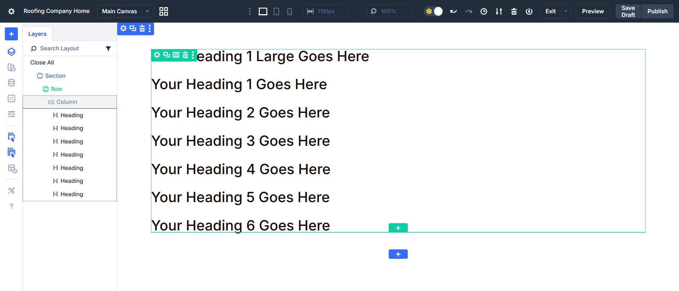
Click the Option Group Preset chip in the Heading Text option group, then create a new preset named H1 Large Size. Set the Font Size to your H1 – Large variable and Line Height to the 1.2 variable.
Create presets for the remaining heading levels. Each uses its corresponding size and line height variables:
- H1 Size uses the H1 variable with the 1.2 line height variable.
- H2 Size uses the H2 variable with the 1.3 line height variable.
- H3 Size uses the H3 variable with the 1.3 line height variable.
- H4 Size uses the H4 variable with the 1.4 line height variable.
- H5 Size uses the H5 variable with the 1.4 line height variable.
- H6 Size uses the H6 variable with the 1.4 line height variable.
Heading Color Presets
Still in the Heading Text option group, create Heading Light with Text Color set to your Heading Text Light variable. Use this when headings appear on dark backgrounds.
The dark heading color was already set when we chose a dark text color for the Heading Text Design Variable. So, this Light preset stacks with your size presets to create easy variations. An H2 on a dark section uses H2 Size + Heading Light. The same heading on a light section only uses H2 Size.
Heading CSS Preset
Create Text Wrap Balance with the CSS rule text-wrap: balance; in the Main Element field. Balanced wrapping works better for headings and short text blocks, distributing words more evenly across lines.
Create Text Title Case with the CSS rule text-transform: capitalize; in the Main Element field. This capitalizes the first letter of each word automatically.
If you don’t think you’ll like or need these CSS presets, that is fine, you just won’t include them in the Element Presets below.
Creating Heading Element Presets
Element Presets bundle your most-used combinations of Option Group Presets for quick deployment. Click the Element Preset chip at the top of the Heading module settings.
Create Element Presets for each of your heading sizes (‘H1 – Large’ through ‘H6’). So, for H2, give it a name of H2 Size and assign the Option Group Preset for H2. Do that for each level.
Create an Element Preset named Light and Nest the Heading Light Option Group Preset within it.
Lastly, create two additional Element Presets for balanced text wrapping and capitalization. You can name them the same thing you did on the option group level.
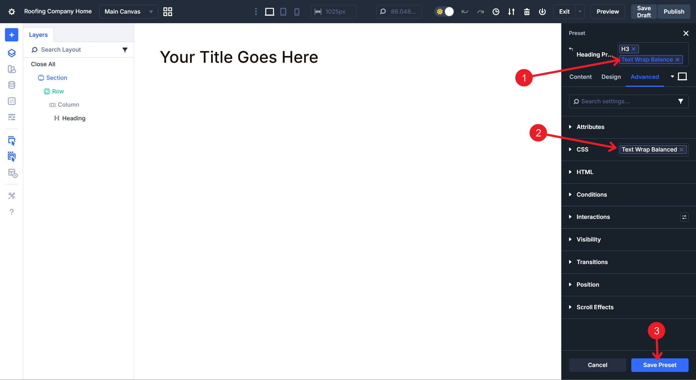
Do this for both the Text Wrap Balance and Text Transform Capitalize Option Group Presets
Depending on your preference, you may want to reorder the presets as they are presented in the Element Preset dropdown. To do that, we can use the Preset Manager to reorder them as you like.
Why Remake These as Element Presets?
I moved all of these to Element Presets, even though they contain nothing but our Option Group Presets, because they are easier to access. To use these presets, click on the element you want to style and stack the Element Presets. You can use the Option Group Presets, but that requires clicking an element, then opening the correct tab, and then clicking the correct Option Group Preset icon again. This is just a shortcut and my preference.
Text Module
There will be a little overlap here, since the Text module can also output headings, but it also brings a few extra styling needs.
In the Text Module, we will create Option Group Presets for body text size, body text color, body text font weight, and a line of CSS. We will then create Element Presets that bundle size, color, weight, and CSS enhancements together.
The Text Module also has heading styles that pair with its Rich Text editor, which supports headings. We will create those Heading styles in a similar, but slightly easier, way than we did with the Heading Module.
Body Text Option Group Presets
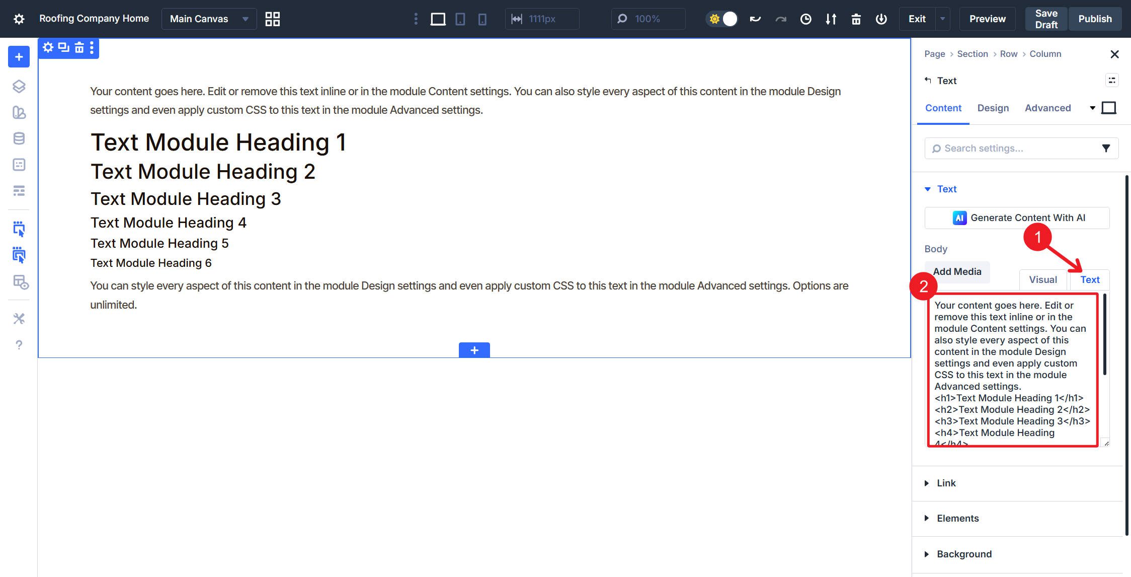
Before building Element Presets, create the Option Group Presets that will nest inside them. Add a Text module to your page and open its settings. In the text tab of the Rich Text editor, include this placeholder text:
Your content goes here. Edit or remove this text inline or in the module Content settings. You can also style every aspect of this content in the module Design settings and even apply custom CSS to this text in the module Advanced settings.Text Module Heading 2
Text Module Heading 3
Text Module Heading 4
Text Module Heading 5
Text Module Heading 6
You can style every aspect of this content in the module Design settings and even apply custom CSS to this text in the module Advanced settings. Options are unlimited. Again, options are:
And if you like numbers:
- Then this is great
- This too, obviously
And lastly, a quote to hang your hat on.
Creativity is seeing what others see and thinking what no one else ever thought. -Albert Einstein
Body Size Presets
In the Text option group under the Design tab, create an Option Group Preset named Normal Text Size. Then set the Font Size to your Body Text Design Variable and Line Height to your Line Height Body variable set at 1.7 using the Body Text Line Height variable. Apply these same settings for links, unordered lists, ordered lists, and quotations.
Do the same thing again, but this time create an Option Group Preset named Small Text Size. Set the Font Size to your Body Text Small variable and Line Height to your 1.6 line height variable. Apply these same settings for links, unordered lists, ordered lists, and quotations.
Body Color Presets
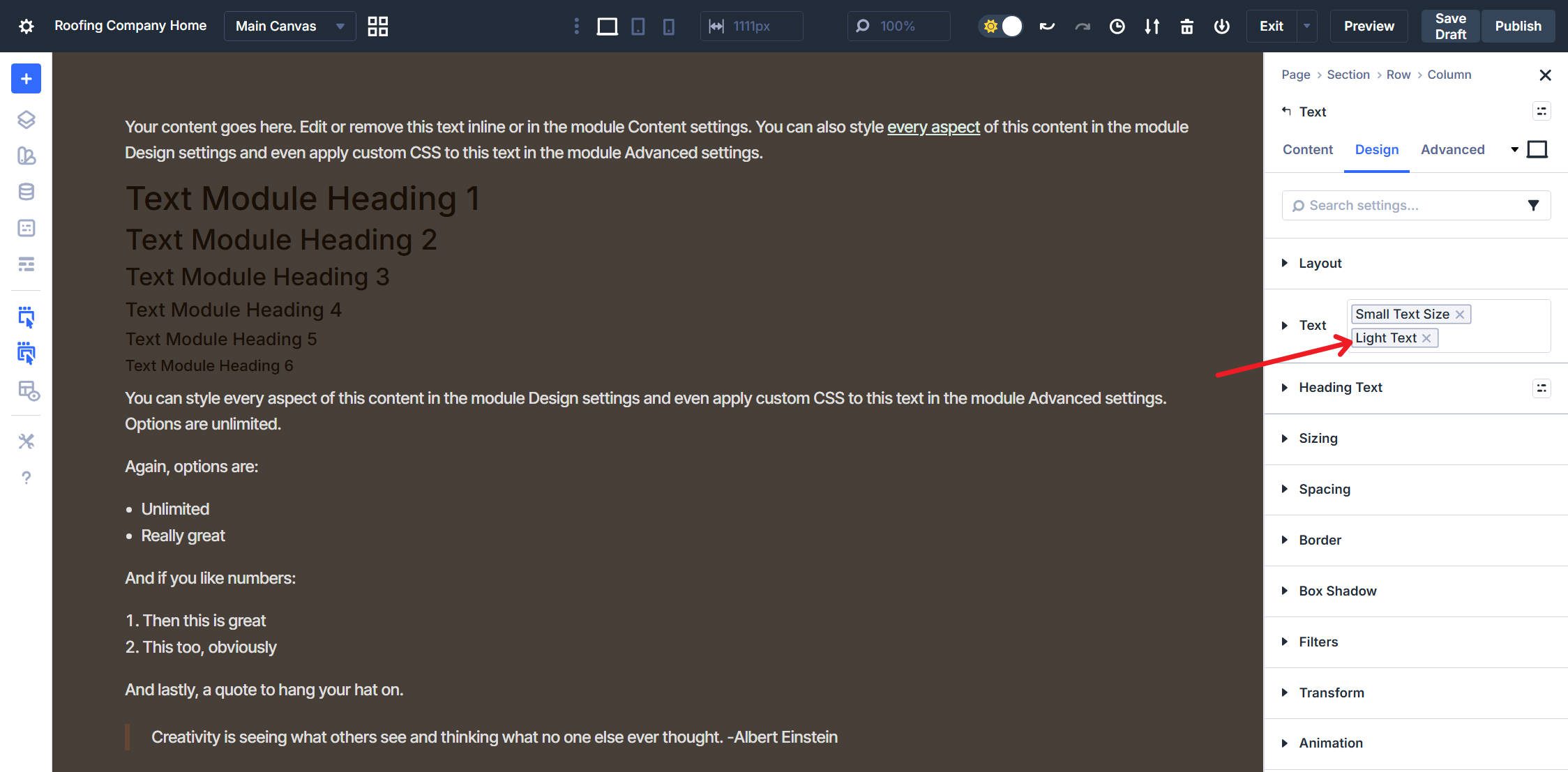
Create a new Option Group Preset named Dark Text and set the Line and Text Color to your Body Text Color variable. Apply the same color for unordered lists, ordered lists, and quotations. However, for links, choose your Secondary Light color variable and underline the text. Open the Hover state, and for the Link, change the Link Color on Hover to Primary Light. Use this when text appears on light backgrounds.
Do the same thing again, but this time create a new Option Group Preset named Light Text with Text Color set to your Body Text Light variable. Apply the same color for unordered lists, ordered lists, and quotations. However, for links, choose your Body Text Light Link variable and add an underline. In the Hover state, use the Secondary Light variable as the link color. Use this when text appears on dark backgrounds.
Body Weight Preset
Set Font Weight to Light and save the Option Group Preset with the name of Font Weight Light. Add more weight presets if your design requires them, but for this example, we will only use one.
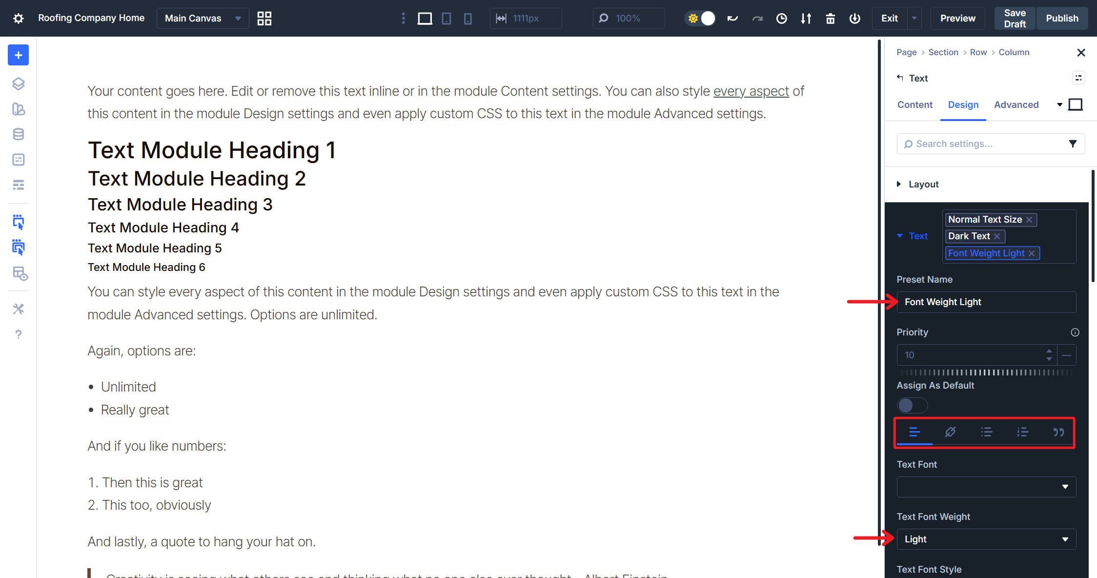
Body CSS Presets
Just like the headings, we can add a single-line CSS rule that can make things look a little better. Under Advanced > CSS, create a new Option Group Preset. Name it Text Wrap Pretty and under Module Elements, locate the Main Element field. Add the CSS rule text-wrap: pretty; and save the preset. This improves line breaks in body text, avoiding orphaned words.
Heading Text Option Group Presets
The Text module has a separate Heading Text option group for H1-H6 tags entered through the rich text editor. Before creating Element Presets, we need Option Group Presets for heading sizes and colors.
Heading Sizes
In the Heading Text option group under Design, configure all six heading levels using your design variables. Set each level’s Font Size and unitless Line Height:
- H1 uses your H1 size variable with the 1.2 Line Height (H1) variable.
- H2 uses your H2 size variable with the 1.3 Line Height (H2-H3) variable.
- H3 uses your H3 size variable with the 1.3 Line Height (H2-H3) variable.
- H4 uses your H4 size variable with the 1.4 Line Height (H4-H6) variable.
- H5 uses your H5 size variable with the 1.4 Line Height (H4-H6) variable.
- H6 uses your H6 size variable with the 1.4 Line Height (H4-H6) variable.
Save all of these in one Heading Option Group Preset with the name Text Heading Sizes. This single Option Group Preset handles all heading levels within Text Modules. The video shows the process, but only for H1 and H2; you should do all of them.
Heading Colors
Still in the Heading Text option group, set Text Color and Line Color for all heading levels to your Heading Text color variable. Save with the name Heading Color Dark.
Do the same and create an Option Group Preset named Heading Color Light with Text Color and Line Color set to your Heading Text Light variable for all heading levels.
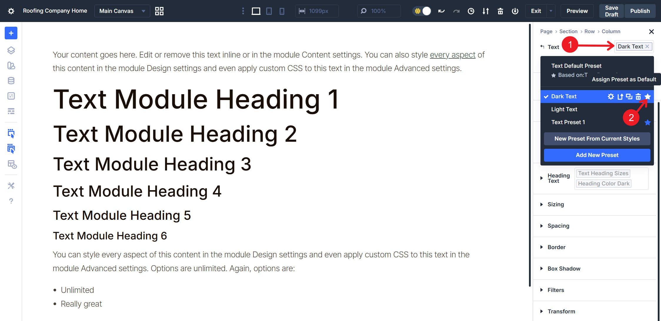
Text Module Element Presets
Now, combine your body text and heading text Option Group Presets into unified Element Presets. Since Text modules can contain both paragraph content and headings, bundling everything together means one-click application instead of stacking multiple presets.
Click the Element Preset chip at the top of the Text module settings panel.
Create Dark Text and nest the following Option Group Presets:
- Normal Text Size from the Text option group
- Dark Text for body color
- Font Weight Light for weight
- Text Wrap Pretty from CSS
- Text Heading Sizes from Heading Text
- Heading Color Dark from Heading Text
Create a Light Text Element Preset using the same structure, but swap Light Text for body color and Heading Color Light for headings.
At this point, the pattern should be clear so we won’t provide separate video for each of these remaining Element Presets. Then, create the next Element Preset named Dark Text Small, nesting Small Text Size, Dark Text, Font Weight Light, Text Wrap Pretty, Text Heading Sizes, and Heading Color Dark.
And lastly, create another Element Preset named Light Text Small. Build it with the same structure as the previous one, only using the light color variants.
Set Dark Text as the default. When you add a new Text module, you now get properly styled body text and headings without any additional configuration.
All the Option Group Presets you made will come in handy as you expand your site. Both of the Text option groups and the standalone Heading option group preset can be reused by other modules. When these option groups are used in other modules, you have yourself a head start.
You could expand this system further, but this is a strong baseline for typography styles. Next, we’ll move on to something a little less tedious — buttons!
Buttons also benefit from a layered setup that uses multiple levels of presets. Color, sizes, and Semantic HTML settings can be used in unique combinations.
Creating separate Option Group Presets for each concern lets you mix and match without duplication. We’ll start with the basics, but you can add other style options, such as No Icon/Icon Option Group Presets, if you wish.
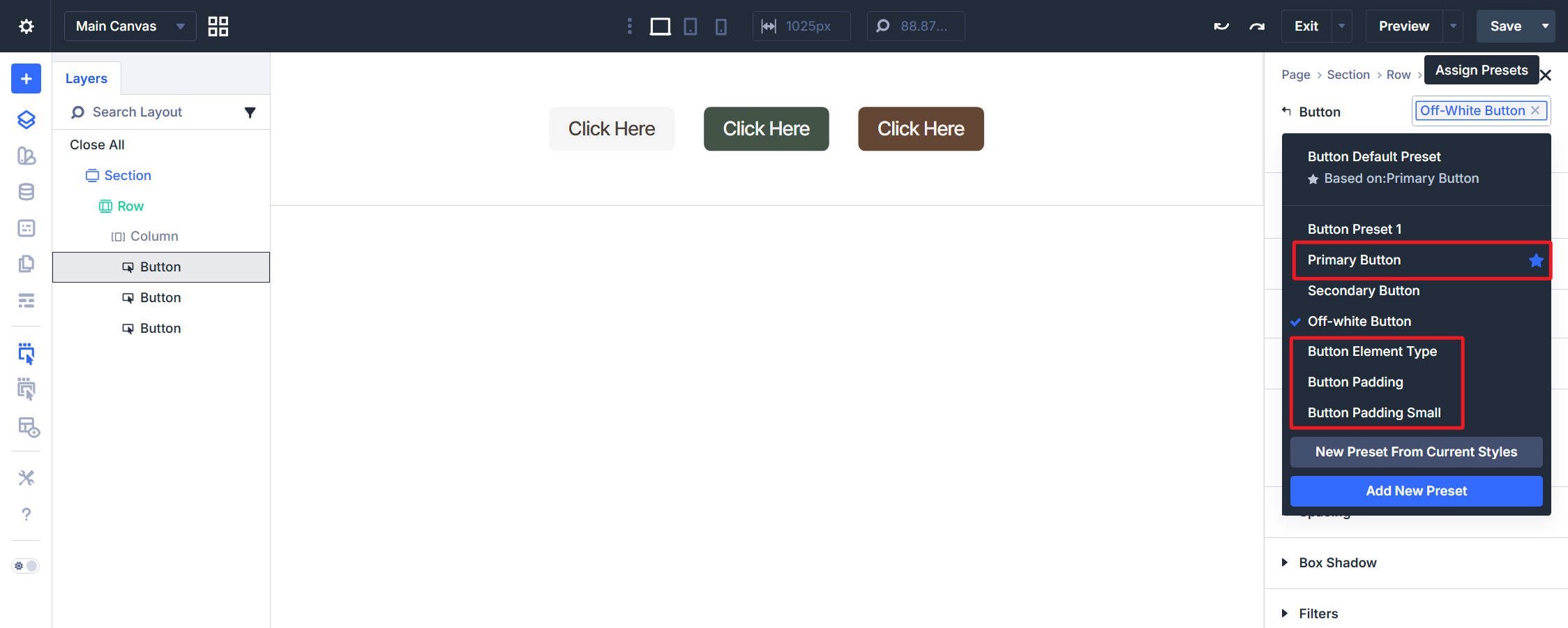
Button Color Presets
Add a Button module and open its settings. Navigate to the Button option group under the Design tab. We will create multiple Option Group Presets for the Button option group. For now, we will focus on background color, text color, and sizing rather than borders or icons.
First, create a Primary Button (Brown) Option Group Preset, set the Button Background Color to your Primary color variable, and set the Button Text Color to Off-white. Click the Hover icon and set the Button Background Color on hover to your Primary Dark color variable. Make sure the Text Color works on hover, then return to Desktop view and Save.
Create Secondary Button (Green) Option Group Preset following the same manner. Set Button Background Color to your Secondary color variable, Button Text Color to a readable color (preferably as a color variable), and set the hover state Background Color to Secondary Dark. You can optionally change the border color, but in later steps I will hide the button border.
Lastly, create an Off-white Button color Option Group Preset using the Off-white variable for the background. Set the Button Text Color to be your Light or normal Body Text color. On Hover state, set Background Color to Off-white with a subtle HSL filter of -5% Lightness.
That gives us three button color variations with hover states.

Button Size Presets
Button sizing involves three general Option Group Presets: border width, spacing (padding), and text size.
Border Width and Radius
Create an Option Group Preset named Button Corners. Set the Border Radius to your Button Border Radius variable (7px). Also, set the Border Width to 0px.
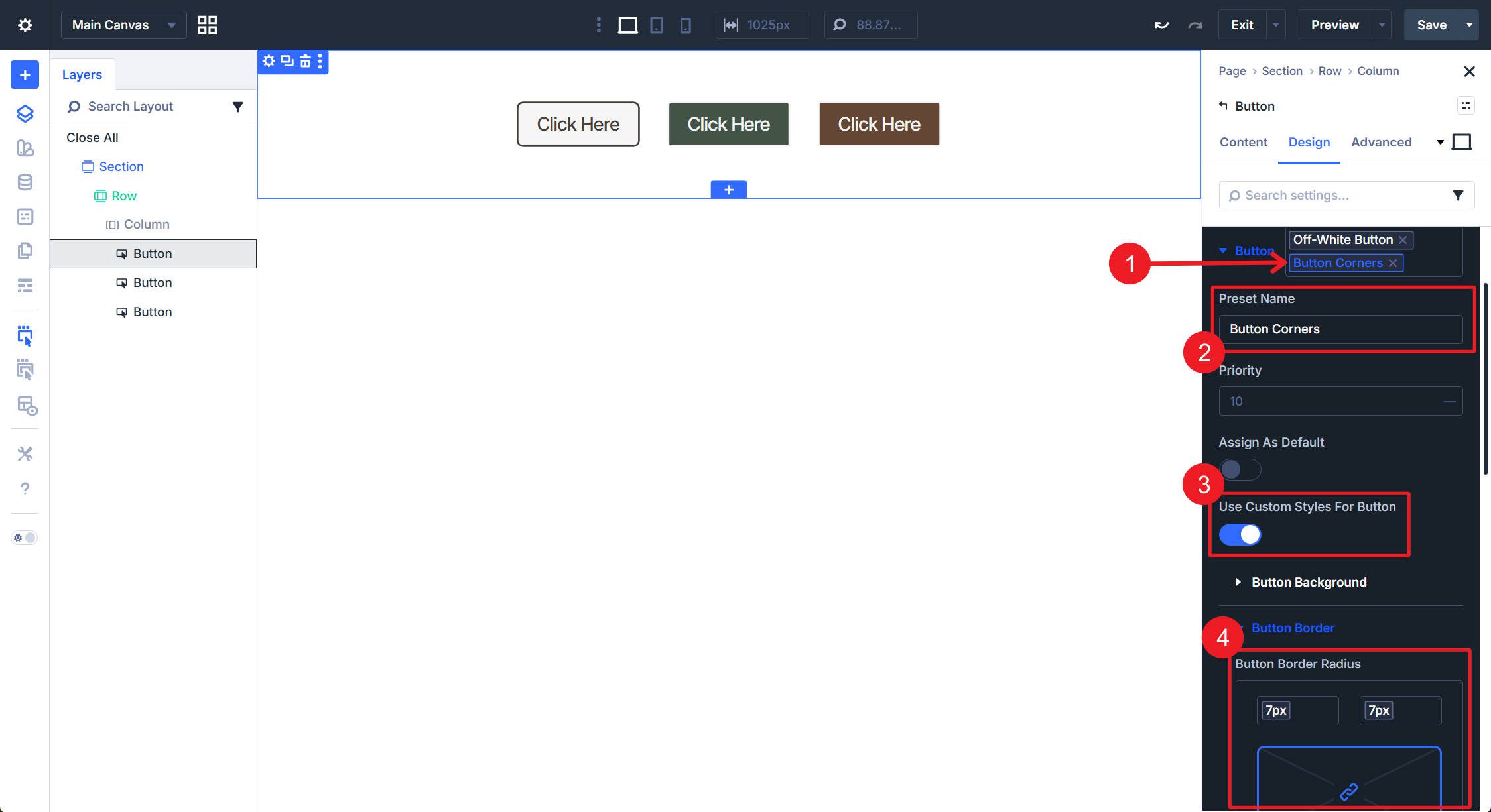
Not shown: Border Width set to 0, and the save button
Padding
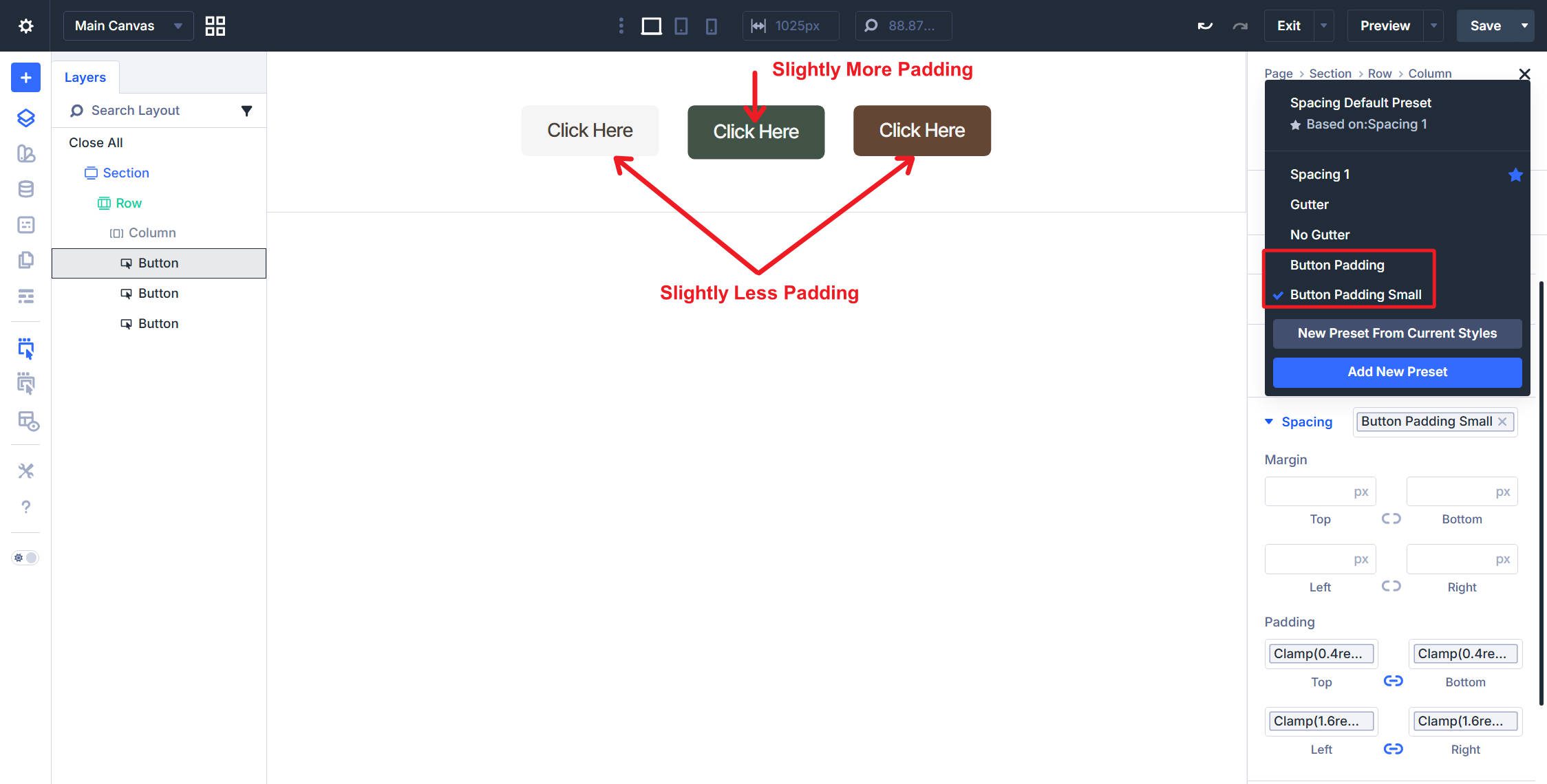
Under Design > Spacing, create an Option Group Preset named Button Padding. Set the Top and Bottom Padding to your Button Vertical Padding variable. Set the Left and Right Padding to your Button Horizontal Padding variable.
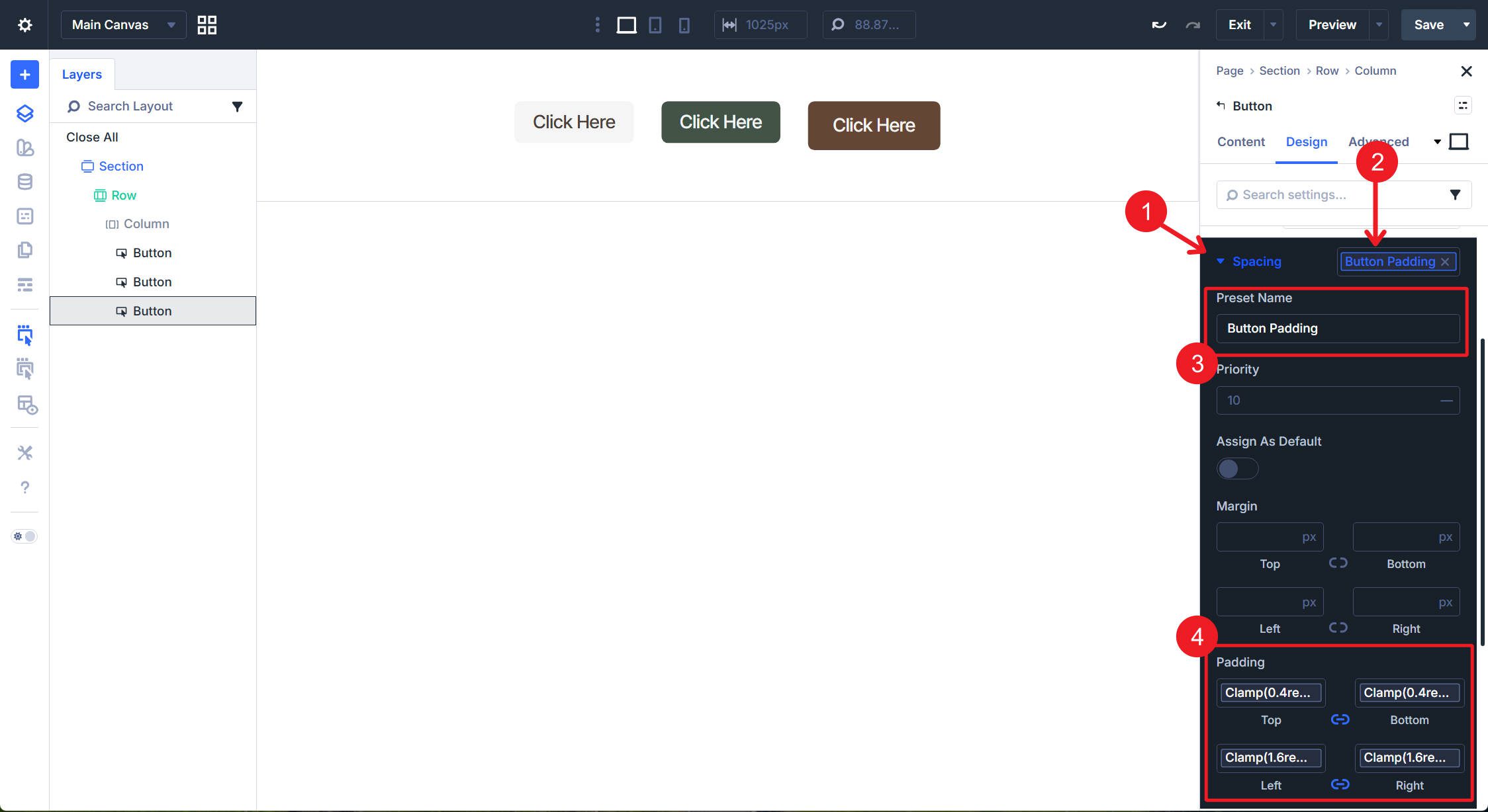
Create Button Padding Small using your Button Vertical Padding Small variable for Top and Bottom Padding. Keep the Left and Right Padding set to Button Horizontal Padding (or reduce slightly if preferred).
Text Size
Under Design > Button, create an Option Group Preset named Button Text Size. Set the Font Size to your Body Text variable.
Create Button Text Size Small with Font Size set to your Body Text Small variable. You can duplicate your previous Option Group Preset if that is faster for you. You now have to preconfigure sizing options as well.
Button Semantic HTML Preset
When a button is used to store a URL (so clicking the button takes the user to another page), you should keep the button as an element ( meaning a standard link).
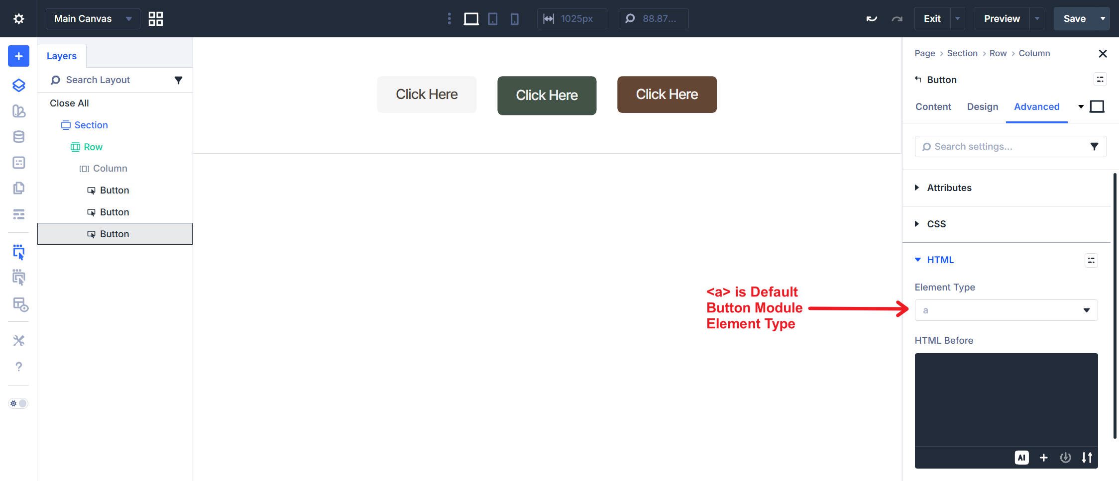
However, if you attach JavaScript to a button, use it in a contact form, or trigger an Interaction from a button click, you should use a different semantic HTML element. In these cases, you should set your Button Module to adopt the
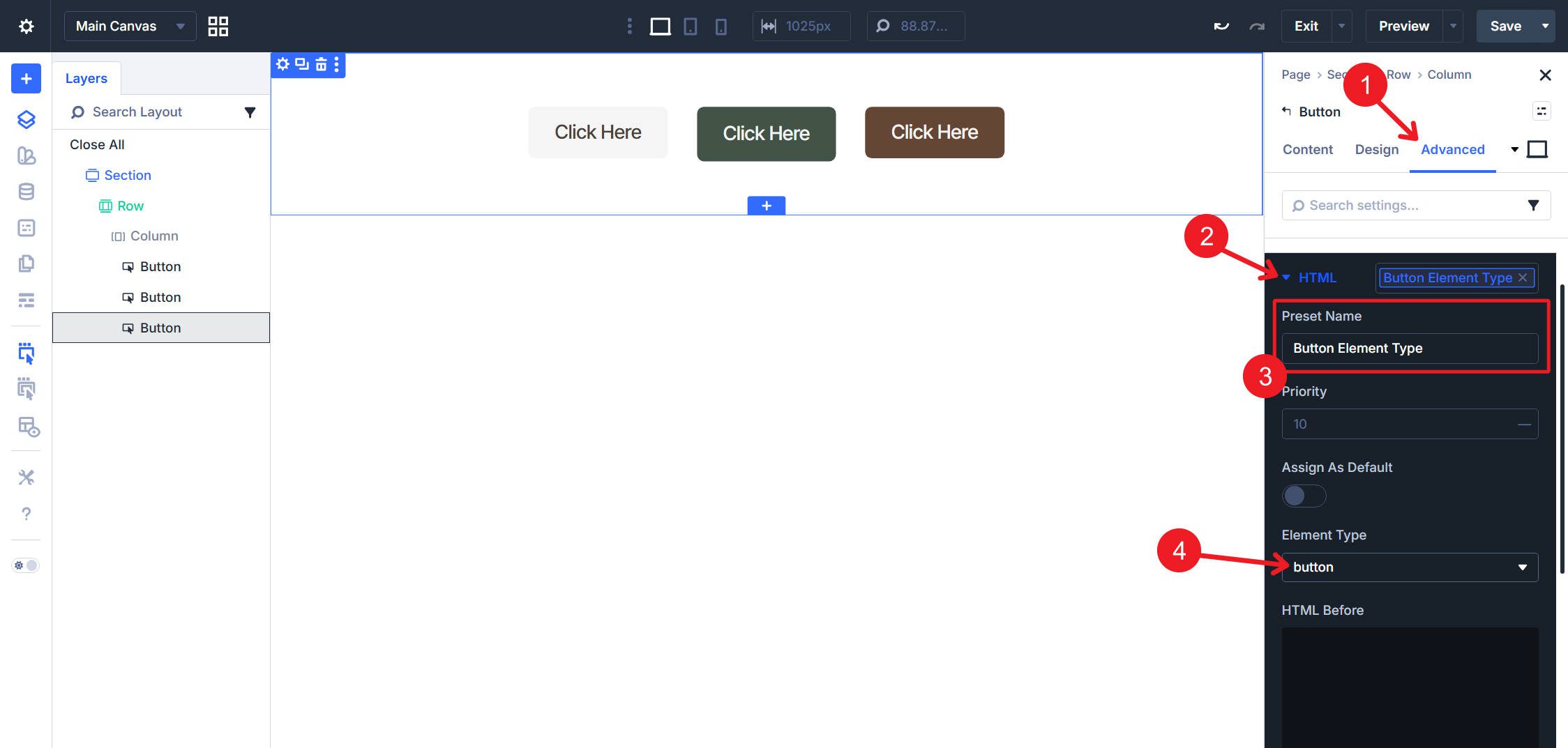
Go to the Advanced tab > HTML and create an Option Group Preset named Button Element Type. Inside the Preset, choose from the dropdown of available semantic HTML tags.
There’s an important reason we built all these presets at the option group level. If we built them only as Button Element Presets, we would not be able to apply the same Option Group Presets to modules like the Contact Form Module.
But Element Presets have a place, and we will use them to combine our Option Group Presets into ready-to-use button configurations. I’d clear out any Option Group Presets on existing Button Modules, delete them, and add new ones so you can see exactly what you’re adding to the Element Preset.
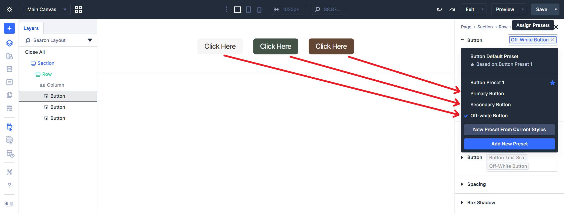
Click the Element Preset chip at the top of the Button module settings and click Add New Preset. Create Primary Button and nest the following Option Group Presets: Primary Button (Brown) from the Button option group for colors, Button Text Size from Button, and Button Corners from Border.
Following the same steps, create Secondary Button nesting Secondary Button (Green), Button Text Size, and Button Corners. And then again, create Off-white Button by nesting Off-white Button, Button Text Size, and Button Corners.
Set the Primary Button as the default if most buttons on your site will be primary CTAs.
At this point, we can also quickly create Element Presets named Button Padding, Button Padding Small, and Button Element Type. In each of these, assign the one Option Group Preset to the Button Element Preset with the matching name.
No matter which tab you are on, you can quickly assign different padding and element types at the Preset level. This is a nice time-saver that lets you avoid clicking into a specific tab to make an assignment.
Lastly, we can create a Small Button Element Preset that handles size overrides. Nest Button Padding Small and Button Text Size Small. Do not include any color presets.
To create a small primary button, apply Primary Button first, then stack Small Button and Button Padding Small after it. Because they are applied last, any overlapping styles in the presets will default to those with a higher priority number (in the Preset settings) or those that are at the bottom of the Active Preset list.
Part 5: Odds And Ends
We will set up a quick Image Element Preset. Add an Image Module to your page. Create a new Element Preset and name it Image Corners. Go to Design > Border and set the Border Radius to your Image Border Radius variable.
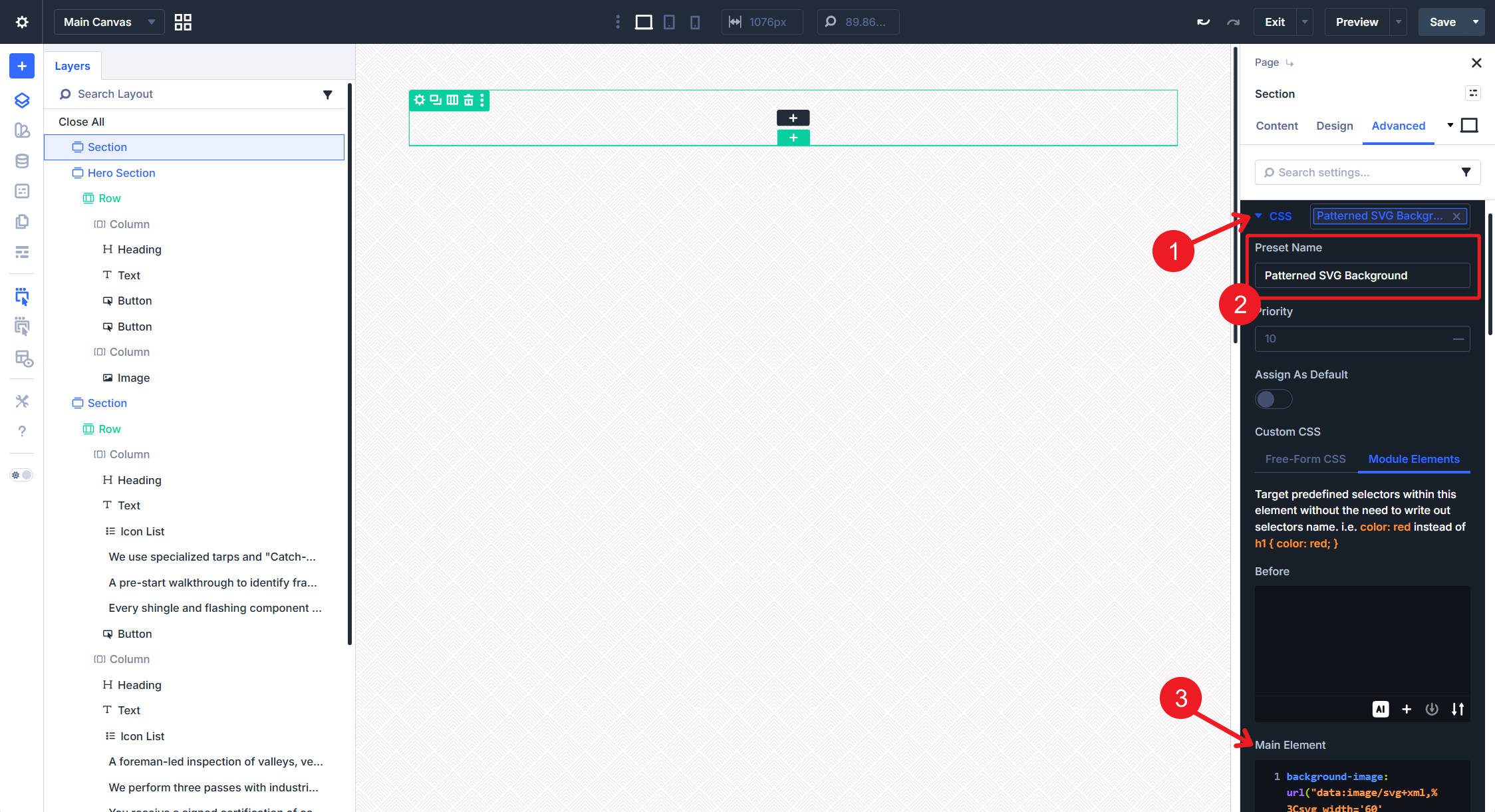
After that, let’s set up a quick SVG background-image preset in the CSS option group. Name it Patterned SVG Background and add this CSS to the Module Elements > Main Elements field. I’ll use this SVG, but it has some hardcoded colors — you can find this type of thing online.
background-image: url("data:image/svg+xml,%3Csvg width="60" height="60" viewBox='0 0 60 60' xmlns="http://www.w3.org/2000/svg"%3E%3Cpath d='M54.627 0l.83.828-1.415 1.415L51.8 0h2.827zM5.373 0l-.83.828L5.96 2.243 8.2 0H5.374zM48.97 0l3.657 3.657-1.414 1.414L46.143 0h2.828zM11.03 0L7.372 3.657 8.787 5.07 13.857 0H11.03zm32.284 0L49.8 6.485 48.384 7.9l-7.9-7.9h2.83zM16.686 0L10.2 6.485 11.616 7.9l7.9-7.9h-2.83zm20.97 0l9.315 9.314-1.414 1.414L34.828 0h2.83zM22.344 0L13.03 9.314l1.414 1.414L25.172 0h-2.83zM32 0l12.142 12.142-1.414 1.414L30 .828 17.272 13.556l-1.414-1.414L28 0h4zM.284 0l28 28-1.414 1.414L0 2.544V0h.284zM0 5.373l25.456 25.455-1.414 1.415L0 8.2V5.374zm0 5.656l22.627 22.627-1.414 1.414L0 13.86v-2.83zm0 5.656l19.8 19.8-1.415 1.413L0 19.514v-2.83zm0 5.657l16.97 16.97-1.414 1.415L0 25.172v-2.83zM0 28l14.142 14.142-1.414 1.414L0 30.828V28zm0 5.657L11.314 44.97 9.9 46.386l-9.9-9.9v-2.828zm0 5.657L8.485 47.8 7.07 49.212 0 42.143v-2.83zm0 5.657l5.657 5.657-1.414 1.415L0 47.8v-2.83zm0 5.657l2.828 2.83-1.414 1.413L0 53.456v-2.83zM54.627 60L30 35.373 5.373 60H8.2L30 38.2 51.8 60h2.827zm-5.656 0L30 41.03 11.03 60h2.828L30 43.858 46.142 60h2.83zm-5.656 0L30 46.686 16.686 60h2.83L30 49.515 40.485 60h2.83zm-5.657 0L30 52.343 22.343 60h2.83L30 55.172 34.828 60h2.83zM32 60l-2-2-2 2h4zM59.716 0l-28 28 1.414 1.414L60 2.544V0h-.284zM60 5.373L34.544 30.828l1.414 1.415L60 8.2V5.374zm0 5.656L37.373 33.656l1.414 1.414L60 13.86v-2.83zm0 5.656l-19.8 19.8 1.415 1.413L60 19.514v-2.83zm0 5.657l-16.97 16.97 1.414 1.415L60 25.172v-2.83zM60 28L45.858 42.142l1.414 1.414L60 30.828V28zm0 5.657L48.686 44.97l1.415 1.415 9.9-9.9v-2.828zm0 5.657L51.515 47.8l1.414 1.413 7.07-7.07v-2.83zm0 5.657l-5.657 5.657 1.414 1.415L60 47.8v-2.83zm0 5.657l-2.828 2.83 1.414 1.413L60 53.456v-2.83zM39.9 16.385l1.414-1.414L30 3.658 18.686 14.97l1.415 1.415 9.9-9.9 9.9 9.9zm-2.83 2.828l1.415-1.414L30 9.313 21.515 17.8l1.414 1.413 7.07-7.07 7.07 7.07zm-2.827 2.83l1.414-1.416L30 14.97l-5.657 5.657 1.414 1.415L30 17.8l4.243 4.242zm-2.83 2.827l1.415-1.414L30 20.626l-2.828 2.83 1.414 1.414L30 23.456l1.414 1.414zM56.87 59.414L58.284 58 30 29.716 1.716 58l1.414 1.414L30 32.544l26.87 26.87z' fill="%23644634" fill-opacity='0.09' fill-rule="evenodd"/%3E%3C/svg%3E");
background-repeat: repeat;
background-size: 46px 46px;
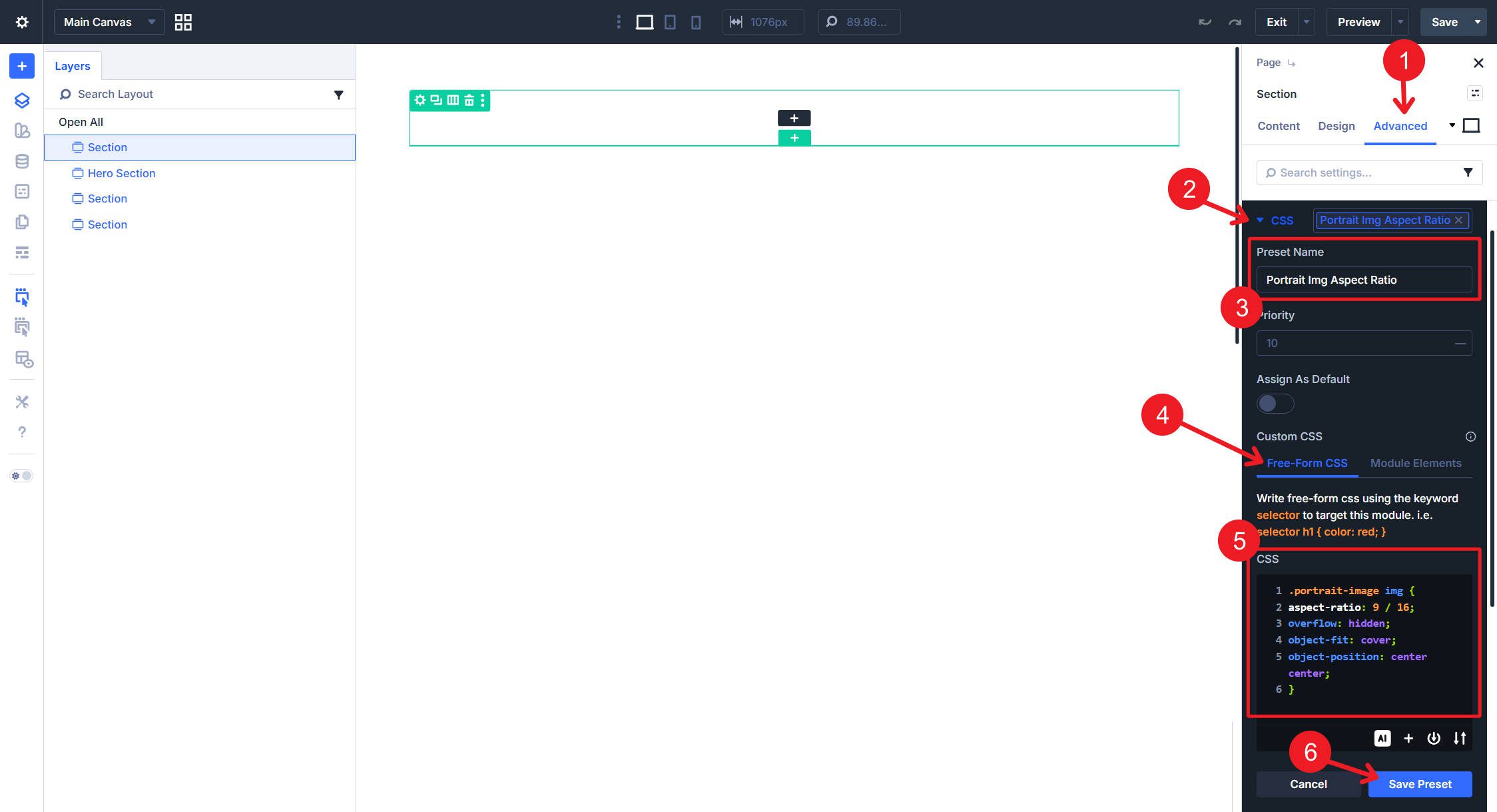
Lastly, I want to add a CSS Preset that displays landscape images in portrait orientation using the aspect-ratio property. This will entail creating a Free-Form CSS preset and an Attributes preset to assign the image class (both have to be used together). When you use this, you might need to set the Module’s width to 100%.
.portrait-image img {
aspect-ratio: 9 / 16;
overflow: hidden;
object-fit: cover;
object-position: center center;
}
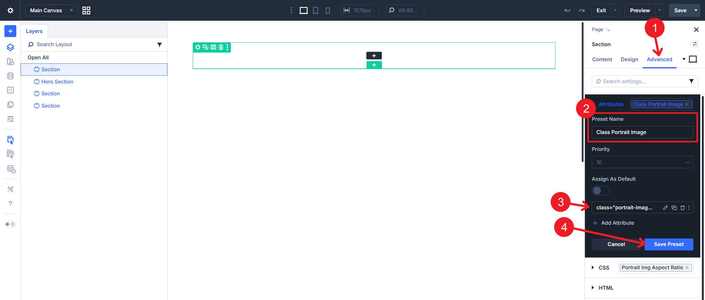
To make this CSS easier to apply, create an Attribute Preset that adds a class to an Image Module.
Part 6: Building The Homepage
This is the payoff part. We have around 40 Design Variables and dozens of presets ready to deploy. Now we add structure, drop in content, and style everything using the system we built. You will notice a dramatic difference in speed—most modules need just two or three preset assignments, and they are done.
We will build four sections: a Hero, a Process section, a Badge section, and a Testimonial section. For each section, we will lay out the structure first, then style it.
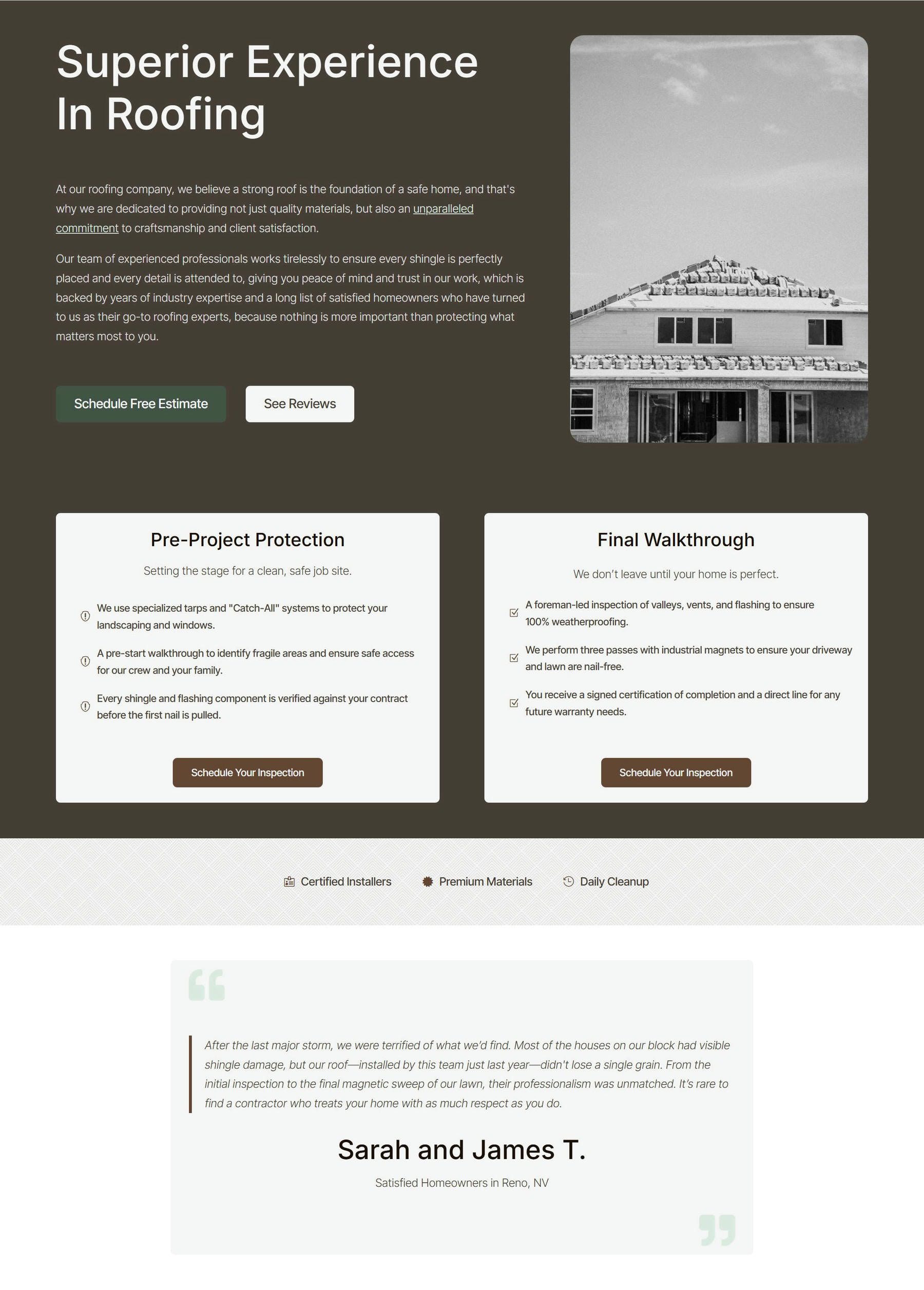
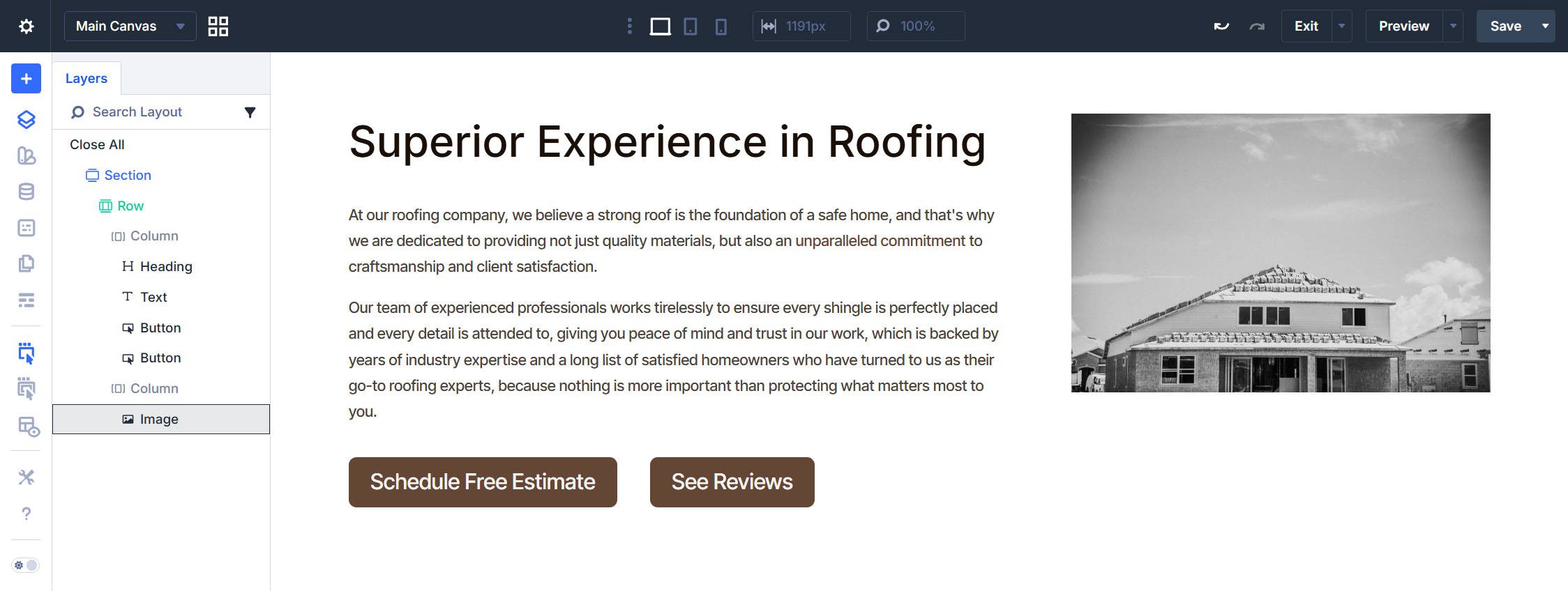
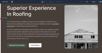
Hero Section
Add a new Section to the page. When prompted to choose a structure, select the 3/5 + 2/5 unequal column Flex layout. This gives you a Row with two Columns—a wider left column for your content and a narrower right column for a hero image. Set the HTML Element Type (in the Advanced Tab) to section.
In the first Column, add a Heading module, a Text module, and two Button modules. Set Column 1 to have Flex Direction: Row and Flex Wrap: Wrap. In the second Column, add an Image module. Your Layers panel should now match the structure in the screenshot below.
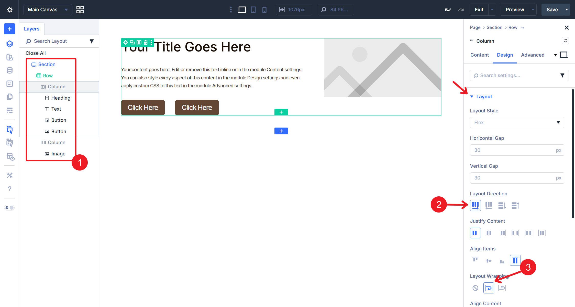
At this point, add your content to each module. For me, it looks like this.
Styling
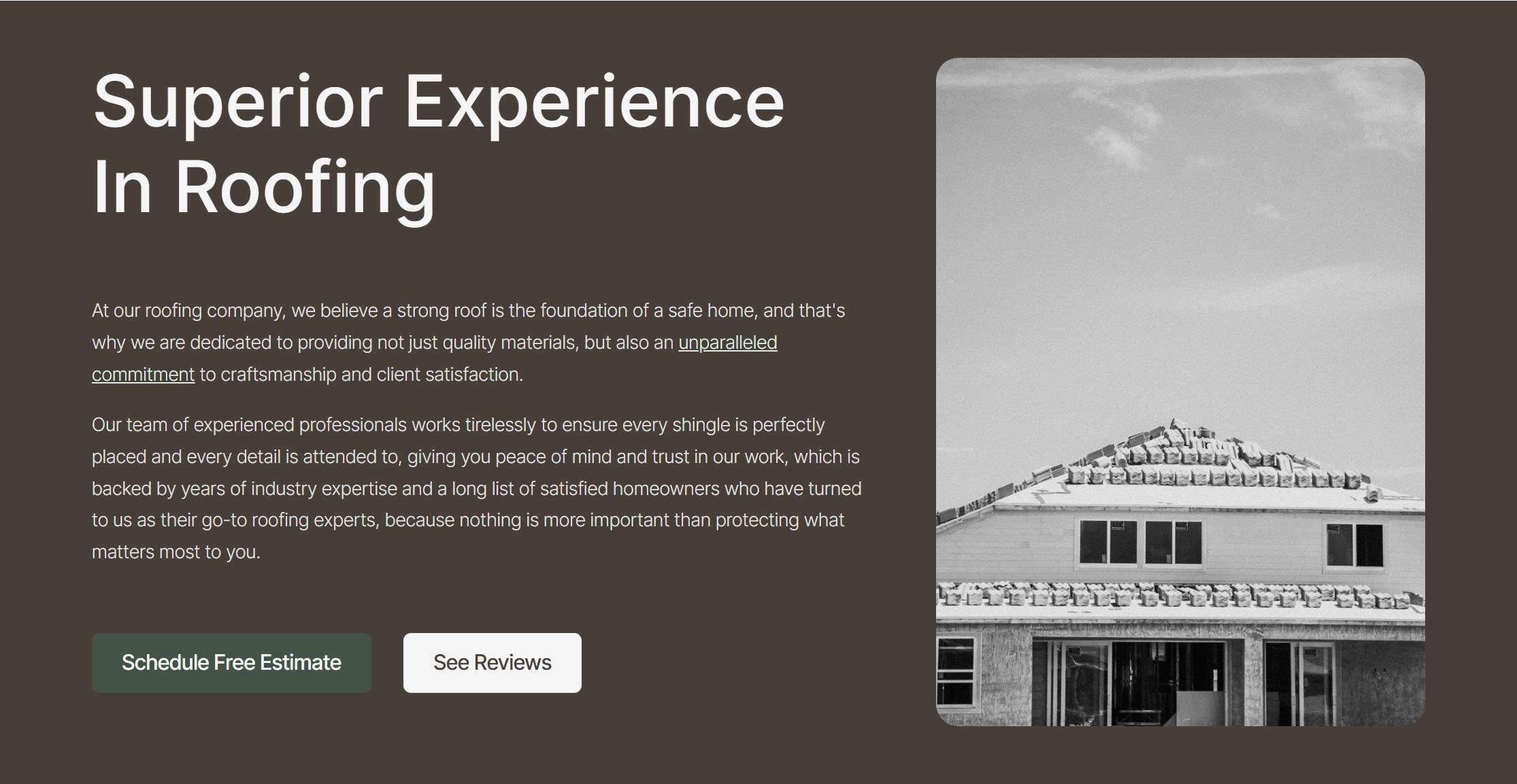
Click the Section and assign the Section – Dark Element Preset. This applies your dark background, gutters, and flex-column layout in a single click. Click the Row. The Row – Standard Width default preset should already be active. No changes needed.
Click the Heading module and stack the following Element Presets: H1 Large, Text Wrap Balance, Light, and Text Title Case. Set the Heading Level on the Module itself to “H1.” Click the Text module and assign the Light Text Element Preset.
Click the first Button, and stack the Secondary Button and Button Padding Element Presets. Click the second Button and stack Off-white Button and Button Padding. Click the Image module and assign the Image Corners Element Preset. Under Design > Sizing, set the Max Height to 80vh and the Width to 100% (or, better in this situation, use the “Force Fullwidth” toggle). Then assign the Portrait Img Aspect Ratio CSS Option Group Preset and the Class Portrait Image Attributes Option Group Preset.
That completes the hero section. Every module was styled by selecting presets with a few minor on-module settings applied throughout.
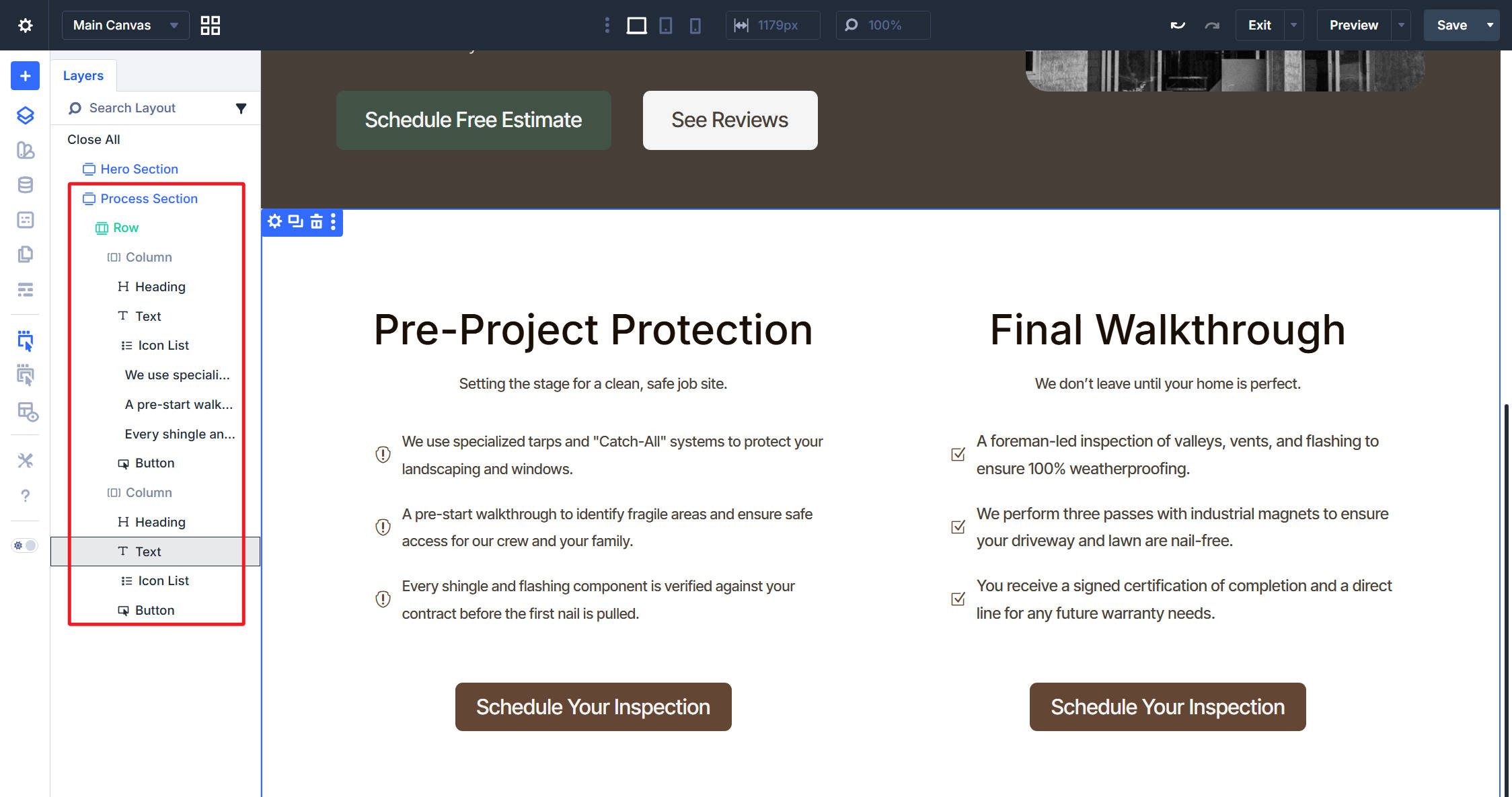
Process Section
Add a new Section and choose the equal two-column Flex layout. In each Column, add a Heading module, a Text module, an Icon List module with three Icon List Items, and a Button module. Add your content to each module in both columns—headings, short descriptions, icon list text, and button labels. Choose whatever icons suit your content.
Styling
We will style everything in the left column first, then extend those styles to the right column at the end.
Click the Section and assign Section – Dark. The Row keeps its Row – Standard Width default. In Column 1, assign the BG – Neutral Background Option Group Preset and the Button Corners Border Option Group Preset—the rounded corners and border settings work just as well on a card-style column as they do on buttons. Then assign the Container Padding Small Spacing Option Group Preset to give content room to breathe inside the card. Also, set the Column to Align Items Center and Space Between.
Click the Heading module. Stack the H5 and Text Wrap Balance Element Presets. Set the Heading Level to H2. The H5 preset controls the visual size while the H2 tag preserves proper document hierarchy—the section still gets an H2 in the source, it just looks smaller by design. Then, align the Heading Center.
Click the Text module and assign the Dark Text Element Preset. Under Design > Spacing, set the Top Margin to -1rem. This pulls the description closer to the heading, breaking the column’s default flex gap in a way that visually groups the heading and its supporting text.
Click the Icon List module. In the Text option group, apply the Small Text Size and Dark Text Option Group Presets. Under Design > Layout, set the Vertical Gap to your Spacing – XSmall variable. In the Icon option group, set the Icon Top Margin to 0. Click the Button and stack the Primary Button, Small Button, and Button Padding Small Element Presets.
With the first Column styled, we can extend design attributes of each module in this column to the next. Here is the Column Design Attributes being extended to all Columns in the Section. Follow the same pattern for the heading, text, icon list, and button.
And again, with relatively few on-module styles, a complete section is done.
Badge Section
Add a new Section with a single-column Flex layout. Inside the Column, add an Icon List module with three Icon List Items. Enter your badge labels and choose an icon for each.
Click the Section and assign the BG – Neutral Background Option Group Preset and the Patterned SVG Background CSS Option Group Preset. The SVG pattern adds subtle visual texture without competing with the content.
Click the Icon List module. Apply the Normal Text Size Option Group Preset in the Text option group. Under Design > Layout, set the Flex Direction to Row, Justify Content to Center, Align Items to Center, and the Horizontal Gap to 3rem. In the Icon option group, set the Icon Top Margin to 0, and in the normal Spacing Option Group, set Padding Bottom to 0 as well.
After a handful of presets and layout assignments, the section is done.
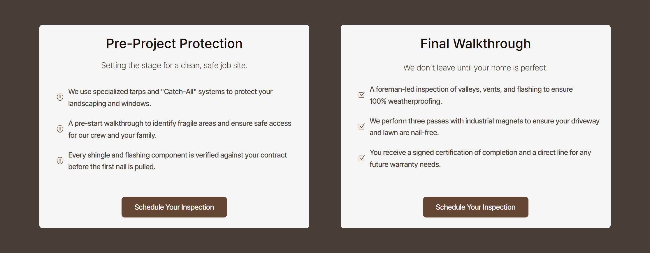
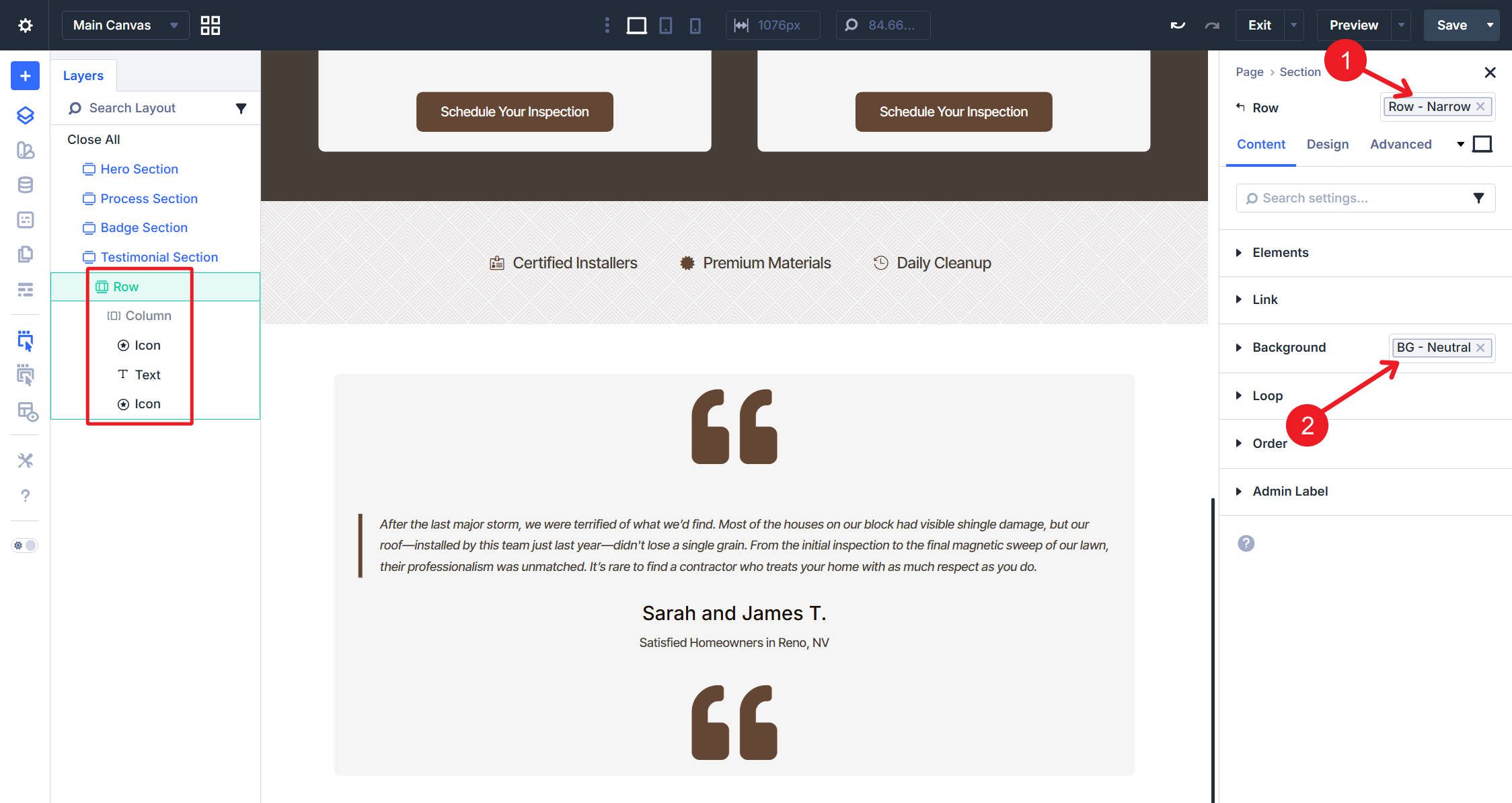
Testimonial Section
Add a new Section with a single-column Flex layout. Assign the Row – Narrow Element Preset to the Row. Also, set the row to BG – Neutral. Inside the Column, add an Icon module, a Text module, and another Icon module.
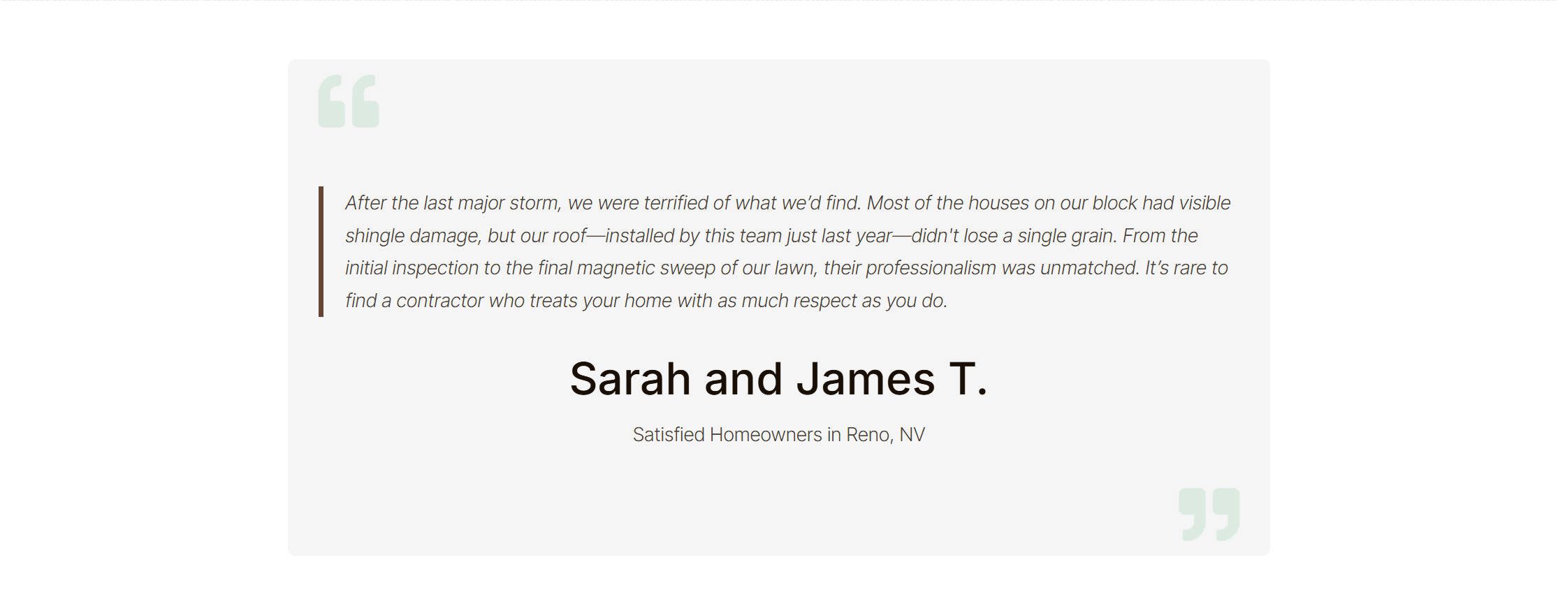
Choose a quotation mark icon for both Icon modules. Set each to use the Secondary Light color variable, an Icon Size of 55, and Alignment to Left. On the second Icon module, go to Design > Transform, then set Rotate Z to 180 degrees. This changes it to look like a closing quotation mark and moves it to the other side.
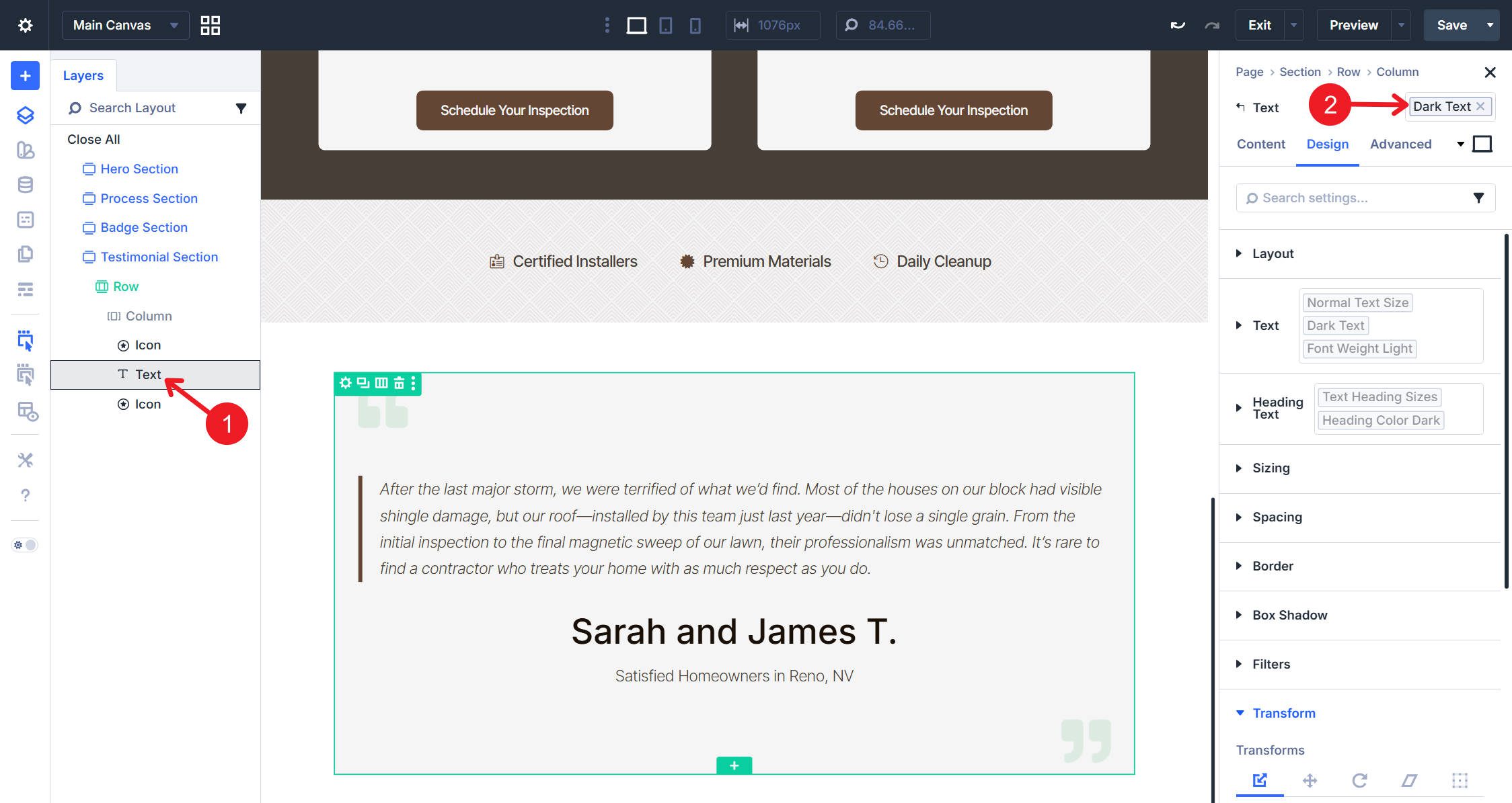
Click the Text module and assign the Dark Text Element Preset. Enter your testimonial as a blockquote, followed by the person’s name as a heading and a short label in normal text beneath it.
And with that, we have our fourth and final section for this tutorial.
Start Building In Divi 5 Today!
This Divi 5 design system approach scales to any complexity. Add more color variants for different background types. Create additional button sizes for different contexts. Build specialized Section presets for specific page types. The modular architecture supports growth without the overhead of traditional preset management.
The design system you built handles 80% of the layouts most sites need. Single-column and double-column sections, properly configured with Flexbox, cover hero sections, feature blocks, content areas, and CTAs. The typography and color systems adapt to any content type. The button variants handle primary, secondary, and tertiary actions.